
Cool Screen Print Designs: From Baseball Graphics to Artistic Poster Ideas
Table of Contents
The seasoned screen printer next to me at a community print workshop glanced at my overly ambitious five-color gradient design and smiled knowingly. “You know what sells best at craft fairs?” she asked, nodding toward her table stacked with prints. “One-color designs with bold shapes. Simple stuff. People think screen printing needs to be complicated, but the coolest designs are often the simplest”. She held up a black-and-white botanical print—just a single fern leaf, perfectly captured with clean lines and dramatic contrast. It was stunning in its simplicity, and she’d sold thirty prints that morning while I struggled with registration on my complex piece. That moment taught me what the screen printing community knows well: simple screen printing designs aren’t a compromise—they’re often the most visually striking, cost-effective, and successfully printable approach. One or two well-chosen colors, bold graphic forms, and confident negative space create designs that reproduce flawlessly while commanding attention. Whether you’re a beginner learning the medium or an experienced printer focusing on efficiency, understanding how simplicity amplifies impact transforms both creative and business success.
Cool screen print designs don’t require complex color separations or advanced techniques—they require strong concepts executed with confidence. The most memorable screen-printed posters, t-shirts, and art prints often feature limited palettes (frequently just black and white), recognizable motifs rendered graphically rather than photographically, and compositions that embrace negative space rather than filling every inch. From botanical screen printing floral designs capturing nature’s forms through simplified line work to geometric patterns creating visual rhythm through repeated shapes, from specialized themes like baseball screen print designs and holiday graphics to timeless black and white screen printing designs—simple approaches span enormous creative territory. As discussed in our comprehensive guide to mastering screen printing designs, working within constraints often produces more powerful results than unlimited options.
This creative guide explores cool screen print designs across various styles and difficulty levels, covering simple screen printing designs perfect for beginners, specialized themed designs for specific markets and occasions, artistic patterns including floral and geometric motifs, black and white designs maximizing contrast, and screen print poster design bringing artistic printmaking to your work. Whether seeking inspiration for your next project, understanding what design styles suit screen printing best, or learning how simplicity creates commercial and artistic success, this guide provides both creative direction and practical understanding of what makes screen print designs cool, effective, and achievable.
Simple Screen Printing Designs for Beginners
Starting with straightforward designs builds skills while producing impressive results.
One-Color Text-Based Designs
Typography-focused designs offer the perfect entry point to screen printing.
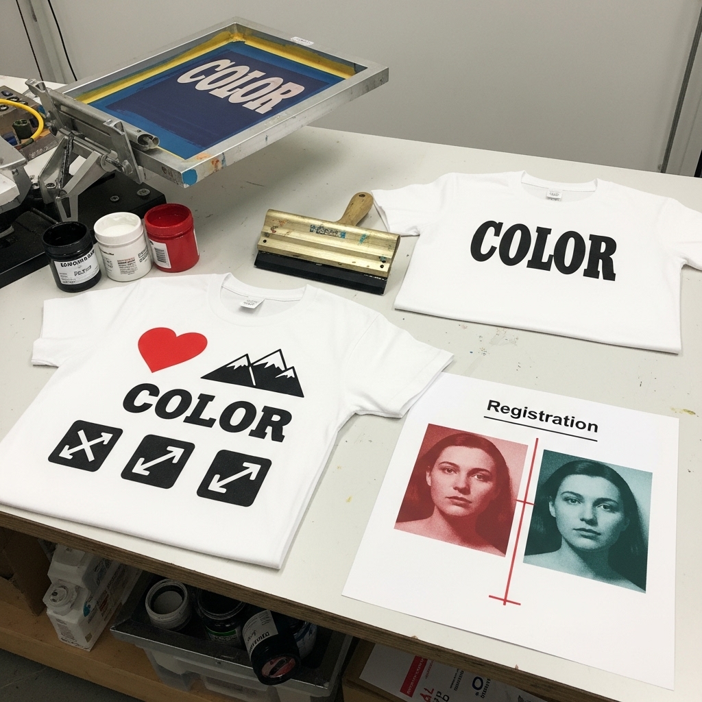
Bold statement text printed in a single color creates maximum impact with minimum complexity. A witty phrase, inspirational quote, or brand name in a strong sans-serif or hand-lettered font requires just one screen and prints quickly. Holden’s Screen guide emphasizes that beginners should “select a simple, bold design with clear outlines, as it will be easier to cut out and print”. Text designs teach fundamental skills—coating screens, achieving proper exposure, maintaining even squeegee pressure—without the added challenge of multi-color registration.
Decorative typography treatments add visual interest while remaining technically simple. Adding subtle decorative elements (rules, borders, small icons) around text creates more complex-looking designs still using just one color. Arranging text in geometric shapes or interesting layouts transforms simple words into graphic compositions. These approaches prove that “simple” doesn’t mean “boring”.
Single-Color Icon and Logo Designs
Graphic symbols and logos work beautifully in one-color screen printing.
Simple shapes with bold outlines reproduce reliably even for beginners. The Easy Screenprinting tutorial notes that “very simple motifs work really well for the beginning screen printer”. Hearts, stars, arrows, mountains, trees, and other recognizable symbols create instant visual communication. These designs can be hand-cut as stencils for the most basic screen printing or created digitally for more precision.
Company logos and brand marks often work perfectly as one-color prints. Many successful brands use simple logomarks designed for reproducibility—think Nike’s swoosh or Apple’s apple. Screen printing these logos on promotional items, staff shirts, or merchandise requires mastering just the fundamental printing process. As explored in our article on how to create a screen print design, proper preparation ensures logos print with crisp edges and solid coverage.
Two-Color Designs: Adding Complexity
Moving to two colors dramatically expands creative possibilities while remaining beginner-friendly.
Color and black combinations create depth and hierarchy. A colored background shape with black text or imagery layered on top provides visual interest and dimension. Or reverse it—black silhouettes with colored accent details. Two-color designs teach registration (aligning multiple screens) without overwhelming complexity.
Duotone effects simulate photographic depth using two ink colors. High-contrast images separated into two tones (typically a dark color for shadows and lighter color for midtones) create striking results. This technique bridges the gap between simple graphics and photographic screen printing.
Specialized Themed Designs
Certain design categories have established aesthetic conventions making them immediately recognizable.
Sports and Athletic Designs
Sports-related screen printing represents a huge commercial market with specific design expectations.
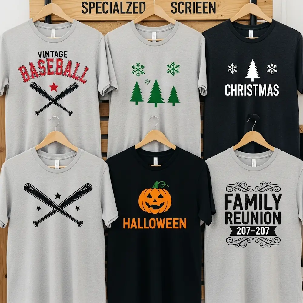
Baseball screen print designs typically feature classic athletic aesthetics. Vintage-inspired team names in arc or script lettering, crossed baseball bats and balls, diamond shapes referencing the field, retro color schemes (red, navy, cream), and distressed textures suggesting worn vintage jerseys all characterize baseball designs. These work beautifully as simple two or three-color prints. The xTool screen printing ideas article lists “Custom T-Shirts, Tank Tops, And Hoodies” as the number one application, with sports designs being a primary category.
Other sports themes follow similar principles. Basketball designs use hoops, balls, and court elements; football designs feature helmets, goalposts, and field markings; soccer designs incorporate balls and goal nets. All translate effectively to screen printing’s bold graphic style.
Holiday and Seasonal Designs
Seasonal themes create time-sensitive demand for screen-printed products.
Christmas screen print designs dominate winter seasonal printing. Simple graphics like snowflakes, Christmas trees, ornaments, and reindeer work as one or two-color designs. Typography-based designs with holiday phrases (“Merry Christmas,” “Happy Holidays,” “Season’s Greetings”) sell consistently. The xTool guide specifically mentions “Holiday-Themed Napkins” as one of fifteen unique screen printing ideas, showing how seasonal designs extend beyond apparel.
Other seasonal opportunities include Halloween (pumpkins, bats, skulls), Easter (eggs, bunnies, spring florals), Fourth of July (stars, stripes, patriotic themes), and Valentine’s Day (hearts, romantic themes). Each season brings distinct visual vocabulary suited to screen printing’s graphic strengths.
Event-Specific Designs
Custom events drive significant screen printing business.
Family reunion t-shirt screen printing designs unite groups with shared identity. Family names in bold lettering, family trees or crests, reunion dates and locations, and shared symbols or inside jokes all work as simple screen prints. These designs typically use one or two colors for budget-conscious printing.
Other events including company picnics, school events, fundraisers, conferences, and festivals all create demand for simple, effective screen-printed products. Our article on screen printing t-shirt designs explores placement and sizing considerations for these event-specific applications.
Artistic and Patterned Designs
Beyond commercial applications, screen printing serves artistic printmaking with distinctive aesthetic traditions.
Screen Printing Floral Designs
Botanical motifs have rich screen printing history spanning vintage to contemporary aesthetics.
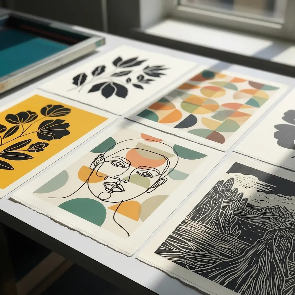
Simplified botanical illustrations capture plant forms through graphic reduction. Rather than photographic realism, effective screen printing floral designs simplify leaves, petals, and stems into bold shapes with strong outlines. The Instagram post showcasing “Monochrome black and white hand-pulled screen-prints” describes designs “based on retro 1970s design motifs, with a little bit of Scandi and folk art mixed in”. This simplified aesthetic suits screen printing perfectly.
Screen printing flower designs range from single blooms to complex botanical compositions. Popular approaches include oversized single flowers as focal points, repeating floral patterns creating allover designs, geometric flowers combining botanical forms with architectural shapes, and vintage-inspired florals referencing 1960s-70s print design. The Shutterstock library offers “32,881 geometrical floral screen print patterns vectors” demonstrating this style’s commercial popularity.
Color choices for floral designs significantly impact aesthetic. Black and white florals create timeless, sophisticated results. Two-color prints using black with a single color (red, blue, mustard yellow) add visual interest while maintaining simplicity. Three-color florals enable more naturalistic results if desired.
Geometric and Abstract Patterns
Geometric screen printing designs leverage the medium’s strength in precise shapes and repeating patterns.
Repeating geometric patterns create visual rhythm through repetition. Circles, triangles, squares, hexagons, and other shapes arranged in grids or other structured layouts produce striking designs. These patterns work beautifully for textiles, wallpaper, and decorative objects beyond standard apparel. The iStock library shows “239,542 Geometric Floral Pattern stock illustrations” combining geometric structure with organic motifs.
Abstract compositions using geometric forms create contemporary artistic prints. Layered shapes in multiple colors, asymmetrical balanced compositions, and bold color combinations all suit screen printing’s technical characteristics. These designs often embrace the medium’s visible ink texture and imperfect registration as aesthetic features rather than flaws.
Retro and mid-century modern patterns reference screen printing’s golden age. Scandinavian-inspired patterns, 1970s geometric motifs, and Art Deco-influenced designs all have strong geometric foundations working perfectly in screen printing. These vintage-inspired aesthetics remain commercially popular.
Line Art and Illustrative Designs
Hand-drawn illustrations translated to screen printing create distinctive artistic results.
Continuous line drawings work beautifully as single-color prints. Illustrations created from unbroken lines—portraits, landscapes, objects—have elegant simplicity while showing artistic skill. These designs benefit from screen printing’s ability to reproduce consistent line weight across large editions.
Woodcut and linocut-inspired designs reference traditional printmaking aesthetics. Bold black shapes with deliberate texture, high contrast between positive and negative space, and strong graphic impact all characterize this style. Screen printing offers faster, more consistent reproduction than actual relief printmaking while maintaining similar visual character.
Black and White Screen Printing Designs
Monochromatic designs represent screen printing at its most essential and often most striking.

The Power of High Contrast
Black and white designs maximize visual impact through contrast alone.
Solid black on white creates maximum legibility and drama. Text, logos, and graphics printed in pure black on white shirts or paper command attention without color distraction. This classic approach suits band merchandise, political graphics, street art-inspired designs, and minimalist aesthetics. The Etsy marketplace for “black and white screen print” shows thousands of designs proving this palette’s enduring popularity.
White on black (reverse printing) provides equally dramatic results with different mood. White ink on black fabric or paper creates striking contrast suited to contemporary, sophisticated, or edgy aesthetics. This combination works especially well for text-heavy designs where white letters on black maximize readability.
Halftone and Photographic Black and White
Converting photographs to black and white halftones creates printable photographic effects.
Portrait prints using halftone dots produce detailed photographic reproductions in a single color. High-contrast portraits with dramatic lighting work particularly well. As discussed in our guide to the best design software for screen printing, creating effective halftones requires proper dot size and frequency selection.
Landscape and architectural photography translated to halftones creates artistic prints. Bold compositions with strong tonal range survive the conversion to dots better than subtle, low-contrast images. These prints bridge fine art photography and printmaking.
Screen Print Poster Design
Poster design represents screen printing’s artistic and commercial peak, with rich traditions spanning concert posters to contemporary limited editions.
Vintage-Inspired Poster Aesthetics
Historical screen printing styles continue influencing contemporary design.
Psychedelic rock posters from the 1960s-70s established iconic screen printing aesthetics. Wavy hand-drawn lettering, vibrant color combinations, organic flowing forms, and dense compositional filling characterize this style. Contemporary designs referencing this era leverage screen printing’s cultural associations.
Propaganda-style graphics using bold shapes, limited colors, and strong messages create powerful visual communication. This aesthetic suits political designs, social causes, and anywhere strong statements need maximum impact.
Contemporary Limited Edition Prints
Modern screen printing continues as fine art medium alongside commercial applications.
Artistic editions by contemporary printmakers command collector interest. Hand-pulled prints in limited quantities, signed and numbered editions, and innovative techniques pushing screen printing’s boundaries all maintain the medium’s artistic credibility. These prints often embrace handmade quality and visible process marks as aesthetic features.
Exhibition posters and gig posters maintain screen printing’s association with music and culture. Custom prints for specific concerts, gallery shows, or cultural events create collectible objects beyond mere advertising. This category bridges commercial and artistic screen printing.
Practical Tips for Designing Cool Screen Prints
Several principles separate effective screen print designs from digital graphics that don’t translate well.
Embrace Negative Space
Don’t fear empty areas—negative space creates visual breathing room and emphasizes positive elements. Designs that fill every inch often look cluttered and amateurish. Cool screen print designs typically show confident use of negative space, allowing bold elements to stand out.
Consider the Substrate
Design for your printing surface. Designs for dark shirts need different approaches than white shirts. Posters printed on colored paper create different effects than white paper. Tote bag designs must account for fabric texture and flex. The xTool ideas article lists diverse substrates including “Personalized Tote Bags,” “Throw Pillows,” and “Wall Art,” each requiring design consideration.
Test and Iterate
Print samples before production runs. What looks good on screen doesn’t always work in physical printing. Test prints reveal issues with sizing, color choices, or details too fine to print reliably. Holden’s Screen guide emphasizes testing throughout the process.
Study Successful Designs
Learn from established screen printing aesthetics. Examine vintage poster collections, contemporary printmakers’ work, and commercial screen printing that succeeds. Understanding why certain designs work helps develop intuition for creating effective new designs.
Conclusion
Cool screen print designs succeed by embracing the medium’s characteristics rather than fighting them—limited color palettes become aesthetic choices rather than limitations, bold graphic forms leverage screen printing’s strength in solid ink coverage, and visible texture and handmade quality distinguish screen prints from digital reproduction. From simple screen printing designs perfect for beginners using one or two colors in clear, bold compositions to specialized themes like screen printing floral designs capturing botanical beauty through simplified forms, from black and white screen printing designs maximizing contrast to artistic screen print poster design maintaining printmaking traditions—simplicity and strategic constraint often produce more striking results than complex multi-color attempts.
The diverse examples explored here—from baseball screen print designs and holiday graphics serving commercial markets to geometric patterns and artistic limited editions pursuing aesthetic excellence—demonstrate screen printing’s remarkable range within seemingly narrow technical parameters. Whether creating custom merchandise, artistic prints for exhibition, or launching product lines, understanding what makes designs “cool” and “simple” simultaneously provides both creative direction and practical success. As that experienced printer at the workshop taught me, the most compelling screen prints often come from confident restraint rather than ambitious complexity.
For comprehensive technical foundation supporting the creative approaches discussed here, explore our pillar guide to mastering screen printing designs covering fundamental principles and processes, our detailed article on screen printing t-shirt designs for apparel-specific sizing and placement standards, our software guide exploring the best design tools for screen printing including halftone creation, and our step-by-step tutorial on how to create a screen print design from concept through production. Together these resources provide complete understanding of screen printing from technical requirements through creative excellence, ensuring your cool designs achieve both aesthetic impact and flawless physical execution.


