
Graphic Design Cover Letter Format & Tips: PDF, Design, and AI-Proofing
Table of Contents
In the visual arts industry, your application is your first design project. Before a hiring manager even reads your words, they judge the visual presentation of your documents. The graphic design cover letter format you choose tells them if you understand layout, typography, and professional standards.
However, there is a hidden challenge. Your beautifully designed letter often has to pass through an Applicant Tracking System (ATS) before it reaches a human eye. If your format is too complex, the robot might reject it.
This guide explores the technical side of applying. We will cover file types, layout strategies, and graphic design cover letter tips to ensure your application looks great to humans and reads clearly to machines. For a broader look at content strategies and examples, be sure to check our main guide on graphic design cover letter examples.
Balancing aesthetics with functionality is the key to success. Below, we will dive into the debate of PDF vs. Word, how to structure your layout, and the essential checklist for a flawless submission.
PDF vs. Word (DOC): The Ultimate Decision
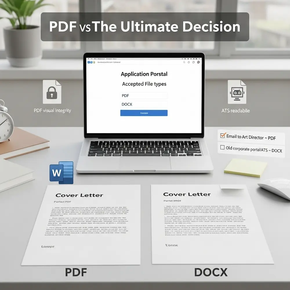
One of the most common questions is whether to send a graphic design cover letter pdf or a Word document. As a designer, your instinct is likely PDF because it locks your design in place. However, the answer often depends on the submission method.
If you are emailing a portfolio directly to an Art Director, a PDF is superior. It ensures your fonts load correctly and your layout stays perfect. But if you are uploading to a corporate portal, a graphic designer cover letter doc might be safer for older systems.
Here is a breakdown to help you decide:
| Feature | PDF Format | Word (DOC/DOCX) |
|---|---|---|
| Visual Integrity | High (Looks exactly as designed) | Low (Fonts may shift) |
| ATS Readability | Medium (Newer systems can read it) | High (Native language of ATS) |
| Design Freedom | Unlimited | Restricted to linear text |
| Professionalism | Standard for Designers | Standard for Corporate/Admin |
Expert Tip: If the job application creates a profile for you and asks you to “upload resume,” check the accepted file types. If it says “PDF recommended,” use PDF. If it’s a very old form that looks like it was built in 1999, stick to DOCX to be safe.
Designing for Readability and Impact
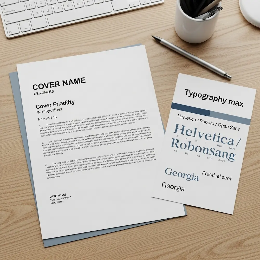
Your cover letter is a document, not a poster. While you want to show off your skills, readability must come first. How to write a good graphic design cover letter involves making it easy for the reader to scan. A wall of text in a fancy font is still a wall of text.
To achieve a professional layout, focus on hierarchy and white space. Here are the design elements you must control:
- Typography Matters Stick to clean, legible fonts. Sans-serifs like Helvetica, Roboto, or Open Sans are modern and safe. If you use a Serif font, ensure it is high-contrast like Bodoni or practical like Georgia. Never use more than two font families.
- Margins and Spacing Give your text room to breathe. Use margins of at least 1 inch (or 2.5 cm) on all sides. Use 1.2 to 1.5 line spacing for the body text. This prevents the “cluttered” look that fatigues the reader.
- Visual Hierarchy Your name should be the biggest element on the page. Section headers (if used) should be bold. The body text should be neutral. Guide the reader’s eye from the top down.
- Consistent Branding Use the same header, color accent, and font as your resume. They should look like a matching set. This demonstrates your ability to maintain brand consistency, a key skill for any designer.
- Color Usage Restraint is powerful. Use black or dark grey for body text. Use a single accent color (like a deep blue or a muted teal) for your name or bullet points. Avoid bright yellows or neons that are hard to read on white paper.
By adhering to these principles, you prove you understand the user experience (UX) of reading a document.
Beating the Bots: ATS Optimization
The Applicant Tracking System (ATS) is the gatekeeper. It scans your document for keywords and converts it into plain text. If your graphic design cover letter format is too creative, the ATS might scramble your information, leading to an automatic rejection.
To ensure your letter passes the bot test, you need to avoid certain design elements that confuse the software.
First, avoid putting important text inside images or complex vector shapes. Most ATS parsers cannot read text embedded in graphics. Second, avoid using columns for the main body text. ATS readers read left-to-right across the whole page. If you have two columns, it might read the first line of column A followed immediately by the first line of column B, creating gibberish.
Critical Warning: Do not use Photoshop to write your cover letter. Exporting a JPEG or a flattened PDF means the text is just pixels. The ATS will see a blank page. Always use InDesign, Illustrator (with text as text), or Word.
The Standard Layout Structure
While the visual design can vary, the structural format of the letter should follow business standards. This structure ensures you cover all necessary information logically. Here is the skeleton of a successful format.
- The Header 📌 Include your Name, Portfolio URL, Email, Phone, and LinkedIn. Link your portfolio clearly.
- Date and Recipient 📌 Current date followed by the Hiring Manager’s name and Company Address. If you don’t have a name, use “Design Team Hiring Manager.”
- Salutation 📌 “Dear [Name]” is best. “Hi [Team Name]” works for startups. Avoid “To Whom It May Concern” if possible.
- The Introduction 📌 State the role you are applying for and a “hook” about why you are interested or qualified.
- Body Paragraphs 📌 Two to three short paragraphs connecting your skills to their problems. Focus on achievements.
- Call to Action (CTA) 📌 Politely request a meeting or portfolio review.
- Sign-off 📌 “Sincerely,” or “Best regards,” followed by your name.
Sticking to this structure helps the hiring manager find the information they need quickly. It respects their time.
File Naming and Submission Tips
You have designed the perfect letter, but the filename is “Untitled-1.pdf”. This looks amateur. Professionalism extends to how you name your files. Here are essential graphic design cover letter tips for the final file.
- Naming Convention Use “FirstName_LastName_CoverLetter.pdf”. If applying to a specific company, add it: “John_Doe_CoverLetter_Google.pdf”. This makes it easy for them to search for your file later.
- File Size Keep your PDF under 2MB. A 20MB cover letter will clog their inbox or get rejected by the server. Compress images if necessary.
- Hyperlinks Double-check that your email and portfolio links are clickable in the final PDF. A dead link is a missed opportunity.
- Metadata If creating a PDF, check the document properties. Ensure the “Author” title is your name, not your computer’s username or “Template.”
- Test Print Print your letter on a black and white printer. Does it still look good? Sometimes colors wash out and text becomes unreadable.
Remember: The goal is to remove friction. If they have to struggle to open your file, read your text, or click your links, they will move on to the next candidate. Make it effortless for them to hire you.
Advanced Formatting: Personal Branding
For senior roles or creative agencies, you can push the format further. Personal branding is about creating a memorable identity. However, ensure your branding enhances the content rather than distracting from it.
Consider using a personal logo in the header. This acts as a stamp of quality. You can also use a subtle watermark or a designed footer that echoes elements from your portfolio website. The key is subtlety. A letterhead should frame the content, not overpower it.
If you are proficient in InDesign, use grid systems to align your header information. Designers notice alignment. If your date is one pixel off from your margin, it will be noticed. Demonstrating a mastery of grid systems in a simple letter speaks volumes about your attention to detail.
Your cover letter format is a subtle portfolio piece. Use it to prove you are a master of layout.
Common Formatting Mistakes to Avoid
Even talented designers make simple mistakes when it comes to document formatting. Avoiding these errors will keep your application in the “Yes” pile.
- Tiny font sizes (keep it 10–12pt).
- Overcrowded margins.
- Inconsistent spacing between paragraphs.
- Using “Justified” text (creates weird gaps).
- Orphan words at the end of paragraphs.
- Blurry logos or icons.
- Files that require a password to open.
Pro Tip: Always left-align your body text. Justified text often creates “rivers” of white space that are distracting and hard to read, especially in ATS viewers. Left-aligned text is the standard for web and digital reading.
Take the time to review your document at 100% zoom. Look for pixelation or alignment errors. Perfectionism pays off here.
Conclusion: The graphic design cover letter format is the foundation of your application. It combines your artistic eye with professional standards. By choosing the right file type, optimizing for ATS, and adhering to clean layout principles, you ensure your message is heard.
Don’t let a bad format ruin a great letter. Treat this document with the same care you would give a client project. When your format is flawless, the hiring manager can focus entirely on your skills and your story. Now, export that PDF and send it with confidence!


