
How to Create a Screen Print Design: Step-by-Step Guide from Concept to Film
Table of Contents
The blank sketchbook page stared back at me, daring me to fill it with something worthy of ink and fabric. I had a concept—a vintage-inspired botanical design for a local coffee roaster’s staff shirts—but translating that vision into a physical screen-printed product felt like crossing a chasm. Where do you even start? Do you sketch by hand or jump straight into software? How many colors can you realistically use? What size should the design be? These questions paralyzed me during my first commercial project until I learned that creating a screen print design isn’t a mystical creative leap—it’s a systematic process with clear, repeatable steps. From that initial concept sketch through digital artwork creation, color separation, file preparation, and finally burning the physical screens, each stage has specific technical requirements and decision points. Miss a step—like forgetting registration marks or exporting at the wrong resolution—and you’ll waste hours fixing problems that could have been prevented with proper workflow. But follow a methodical approach, and you transform abstract ideas into vibrant, durable prints that survive dozens of wash cycles while looking professionally sharp.
Learning how to create a screen print design means understanding both the creative and technical dimensions of this unique medium. Unlike digital printing where you simply send a file to a printer and walk away, screen printing requires preparing artwork that accounts for physical ink layers, color registration tolerances, mesh screen limitations, and photochemical stencil processes. Your design must work within specific constraints—typically 1-4 spot colors, no gradients unless converted to halftones, and sizing appropriate for both the garment and printing equipment. These technical requirements shape creative decisions from the earliest sketching stages, making screen printing a medium where process and artistry intertwine inseparably. As explored in our comprehensive guide to mastering screen printing designs, successful prints emerge from understanding how creative vision translates through technical preparation into physical production.
This step-by-step guide walks through the complete process of how to make designs for screen printing, from initial concept development through final screen preparation ready for production. We’ll cover choosing design ideas suited to screen printing’s strengths, creating digital artwork using appropriate software and techniques, separating colors and preparing registration, technical file preparation for film output, and burning screens from finished artwork. Whether you’re a graphic designer transitioning to print production, an entrepreneur launching custom apparel, or a DIY enthusiast setting up a home studio, this tutorial provides the systematic workflow needed to transform ideas into print-ready screens.
Step 1: Concept and Sketching
Every successful screen print design begins with clear conceptual direction grounded in the medium’s characteristics.
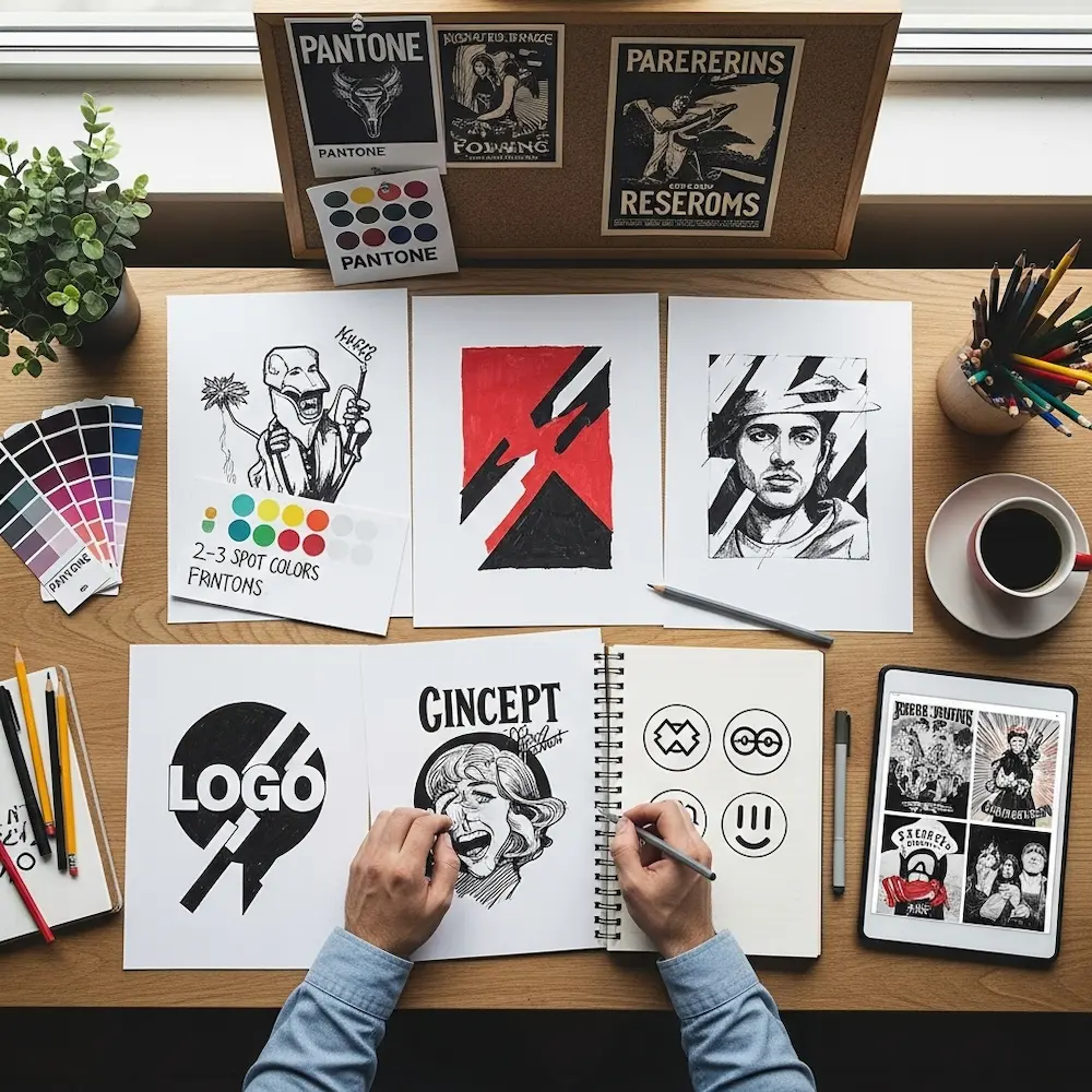
Defining Project Parameters
Before touching pencil to paper or opening design software, establish the project’s fundamental parameters.
Determine your color count budget—the single most important early decision. Each color requires a separate screen, increasing both setup time and costs. One-color designs maximize affordability and simplicity, two-color designs add significant visual interest while remaining economical, three-color designs enable richer compositions, and four-plus colors approach costs requiring larger production runs to justify. As discussed in our pillar article, practical screen printing typically uses 1-6 spot colors rather than unlimited digital palettes. Knowing your color limit before sketching prevents designing a complex six-color masterpiece when budget allows only two colors.
Identify the substrate and context—what will receive the print and how will it be used? T-shirts require different sizing and placement than posters or tote bags. Dark fabrics need white underbases, affecting color count and design approach. Knowing you’re printing on black shirts versus white fundamentally shapes color choices—light pastels that work beautifully on white fabric disappear on black even with underbase. Context matters too: a left-chest corporate logo follows different conventions than a full-front artistic statement.
Research and gather inspiration within screen printing’s aesthetic traditions. Study vintage poster art, band merchandise, skateboard graphics, and other screen-printed work to understand what styles naturally suit the medium. Bold graphics with limited colors, strong typography, geometric patterns, and simplified illustrations all leverage screen printing’s strengths. Photographic work requires advanced halftone techniques we’ll discuss later. Gathering visual references at this stage prevents designing in styles fundamentally unsuited to screen printing.
Initial Sketching and Concept Development
With parameters established, begin exploring ideas through sketching.
Embrace simplification and bold forms. Screen printing rewards designs with clear shapes, strong contrast, and graphic clarity over subtle detail. Sketch multiple variations exploring different compositional approaches—maybe one version emphasizes large central imagery while another features decorative border elements with smaller central focus. Don’t worry about perfection; these sketches map out ideas and compositional relationships that will be refined digitally.
Consider color relationships early. Even in rough sketches, note which elements should be which colors and where colors might overlap. Overlapping colors create new mixed hues in screen printing (unlike digital blending), requiring intentional planning. A red shape overlapping a blue shape creates purple where they meet—is that desirable or problematic? Thinking through color interactions during sketching prevents surprises during separation.
Think about scale and proportion relative to final application. If designing for t-shirts, consider standard sizing—full-front prints typically measure 10-14 inches wide, while left-chest designs stay under 4 inches. Sketching elements that will be tiny in final production may reveal they’re too detailed at that scale. Our detailed article on screen printing t-shirt designs explores placement and sizing standards comprehensively.
Step 2: Digital Artwork Creation
Translating sketches into digital artwork requires appropriate software and understanding how to build print-ready files.
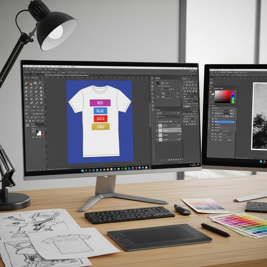
Choosing Your Digital Tools
Select software appropriate for your design type.
Vector software for graphic designs—Adobe Illustrator, Affinity Designer, CorelDRAW, or free Inkscape all handle vector illustration. Vector graphics provide infinitely scalable artwork with crisp edges perfect for screen printing’s stencil process. If your design consists primarily of shapes, text, logos, or graphic illustration, work in vector software from the start. As discussed in our comprehensive article on the best design software for screen printing, vector tools give you mathematical precision and clean separations.
Raster software for photographic elements—Adobe Photoshop, Affinity Photo, or GIMP handle pixel-based imagery. Photographs, complex textures, and designs requiring halftones start in raster software. However, most screen printing designs benefit from hybrid workflows: edit photos in Photoshop, convert them to halftones or high-contrast black-and-white, then import into vector software for layout with text and other elements.
Building Clean, Separation-Friendly Artwork
Creating artwork that separates cleanly requires specific structural approaches.
Use spot colors from the beginning. Don’t design in RGB or CMYK with dozens of colors intending to simplify later—work in your actual printing palette. In Illustrator or Affinity Designer, create custom swatches for each ink color (e.g., “Red,” “Navy Blue,” “Gold”) and use only those swatches throughout the design. This makes color separation as simple as selecting all objects using one swatch and printing them to separate film.
Organize layers logically. Create one layer per ink color, naming them clearly: “Color 1 – Red,” “Color 2 – Blue,” etc. This organizational structure makes separation straightforward and reduces errors. Keep all red elements on the red layer, all blue elements on the blue layer, and so on.
Maintain clean paths and shapes. Avoid unnecessary anchor points creating bumpy edges. Use Illustrator’s “Simplify” command or similar tools to reduce path complexity while maintaining visual form. Clean vector paths reproduce more reliably on screens and create smoother film positives.
Convert all text to outlines/curves before finalizing. Select text elements and convert them to vector shapes (Illustrator: Type > Create Outlines; Affinity: Layer > Convert to Curves). This ensures fonts display correctly even if the printer doesn’t have them installed. Make this conversion late in the process since outlined text can’t be edited as text anymore.
Creating Resolution-Appropriate Artwork
Proper resolution prevents quality issues during film output and screen burning.
Vector elements scale infinitely and don’t have resolution concerns—one advantage of working in vector software. However, any raster elements (photos, textures, imported bitmaps) must be at least 300 DPI at final print size. A photo that’s 300 DPI at 4 inches wide will be only 150 DPI if enlarged to 8 inches—unacceptable for quality screen printing.
Set proper document size matching your final print dimensions. If designing a 12-inch wide full-front t-shirt graphic, create a document at least 12 inches wide at 300 DPI. Working at final size prevents scaling errors and ensures all elements maintain proper resolution.
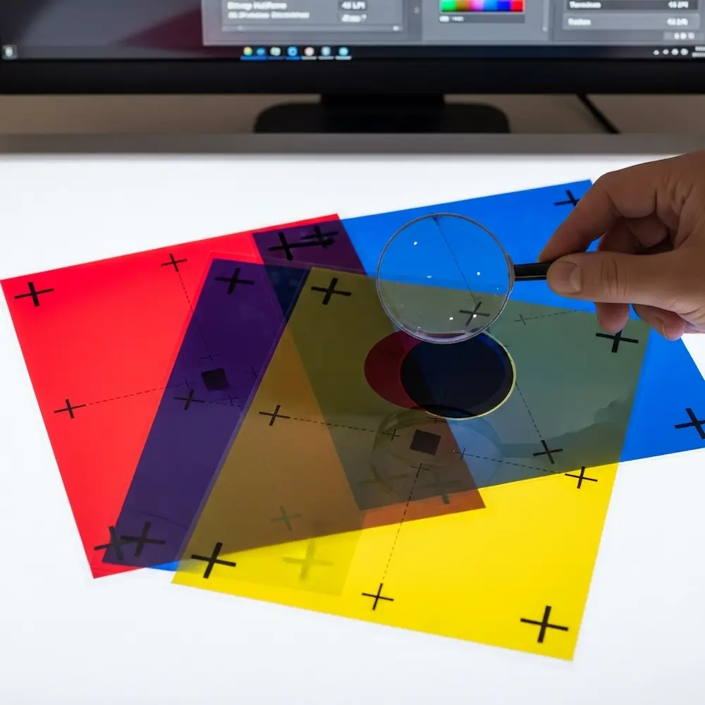
Step 3: Color Separation and Trapping
Separating multi-color designs into individual printable screens represents screen printing’s most critical technical requirement.
Manual Spot Color Separation
For designs using distinct spot colors without overlaps, separation is straightforward.
Separate colors in your design software. With artwork organized by color layers, select all elements of one color and prepare them for isolated output. In vector software, you can hide all layers except one color, then export that view. Or select all objects using one color swatch and copy them to a new document. Each color becomes one black-and-white file where that color prints in solid black and everything else is transparent.
Include registration marks on every separation. Registration marks—typically crosshairs or circles in the corners of your artwork—must appear in identical positions on every color’s film positive. These marks allow the printer to align screens precisely so colors register correctly. Merchcraft’s color separation guide emphasizes: “Always do a test print to check for alignment and color accuracy”—registration marks make this alignment possible.
Understanding and Applying Trapping
Trapping prevents visible gaps between colors when registration isn’t absolutely perfect.
Trapping basics: When two colors meet at an edge, slight misregistration (even 1-2mm) can create visible white gaps where the substrate shows through. Trapping slightly overlaps adjacent colors so minor misregistration doesn’t create gaps. The Reddit screen printing community recommends specific values: “Apply a 1 pt choke (set to mid if using vector) or a 2-pixel choke at 300 DPI in Photoshop”.
Choke vs. spread: Trapping uses two techniques—spread (making one color slightly larger) or choke (making one color slightly smaller where it meets another). Generally, lighter colors spread into darker colors. If you have yellow text on a blue background, you’d typically spread the yellow slightly so it extends into the blue. This way, if registration is slightly off, you see a bit of yellow overlap rather than a blue gap.
When to skip trapping: Designs where colors intentionally don’t touch don’t need trapping. Also, if you know your printer has excellent registration, you might skip trapping—though it’s usually worth the insurance.
Halftone Separation for Photographic Designs
Converting continuous-tone images to printable halftones requires specialized techniques.
Choose appropriate halftone settings. Line frequency (LPI – lines per inch) determines dot size and detail level. Screen printing typically uses 35-55 LPI compared to 150+ LPI in offset printing, since coarser screens handle larger dots better. In Photoshop, convert grayscale images to Bitmap mode, choosing “Halftone Screen” and specifying frequency (45 LPI is a safe starting point), angle (45° avoids directional bias), and shape (round dots are standard).
Consider simulated process for full-color photos. Rather than CMYK halftones (which often look muddy in screen printing), simulated process uses 4-7 custom spot colors selected specifically for the image being printed. This advanced technique requires specialized software like Separation Studio but produces superior photographic results on dark garments. Our pillar article discusses simulated process as one of several advanced screen printing techniques.
Step 4: Preparing the File (Pre-Press)
With separations complete, final file preparation ensures films output correctly.
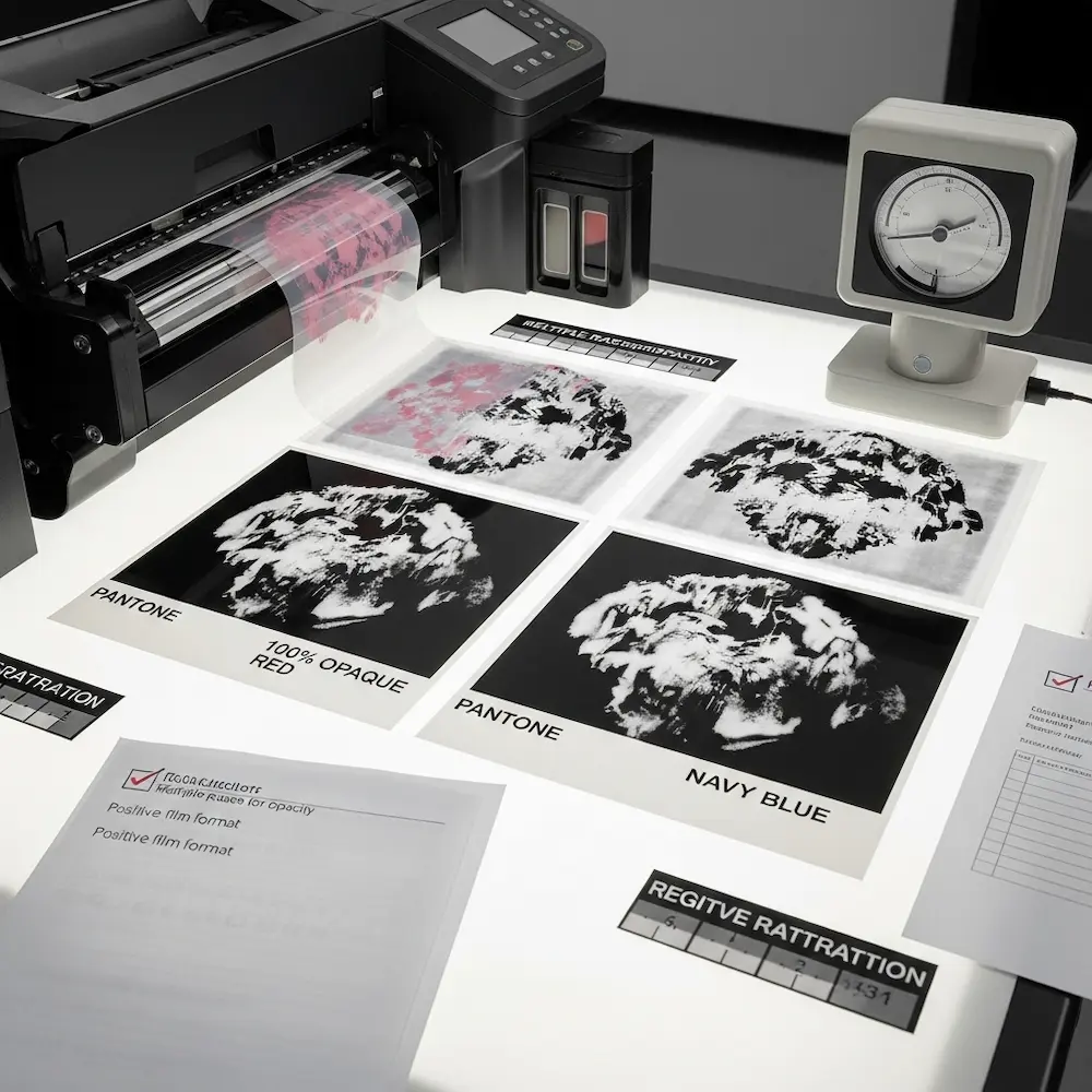
Setting Up Film-Ready Files
Each separated color becomes one film positive—transparent sheet with opaque black defining the stencil.
Create black-and-white output files. Each color separation should be pure black (100% K in CMYK terms) on transparent or white background. Gray areas won’t block UV light sufficiently during screen exposure, causing weak stencils. All artwork must be converted to solid black shapes or halftone dots that are pure black.
Add bleed and safe areas if needed. While t-shirt printing typically doesn’t require bleed (designs are precisely positioned, not trimmed), posters or other products may need artwork extending beyond trim edges. Mark safe areas where critical elements (like text) should stay to avoid getting cut off.
Include printing instructions if sending to a print shop. Note ink colors for each separation (e.g., “Separation 1 = Pantone 185 Red”), print order (light to dark typically), and any special requirements like underbase on dark garments. Clear communication prevents expensive mistakes.
Understanding Film Output Requirements
The physical films must meet specific quality standards.
Film opacity is critical. Black areas must be completely opaque to block UV light during screen exposure. Insufficient opacity creates weak stencils that break down during printing. Professional imagesetters produce optimal films, but DIY screen printers can use inkjet printers with pigment-based black ink on transparency film. Multiple print passes may be needed to achieve sufficient density.
Film size and orientation must match your screen size. The design area should be centered on the film with several inches of clear border around it. Mark “top” or “front” on films so they’re positioned correctly during exposure.
Positive vs. negative films: Most screen printing uses positive films (black artwork on clear background) creating stencils where ink passes through. Less commonly, negative films (clear artwork on black background) create reverse stencils. Confirm which type your process requires.
Step 5: Screen Preparation (Getting the Design on the Screen)
With films ready, the final step transfers your design to physical screens through photochemical exposure.
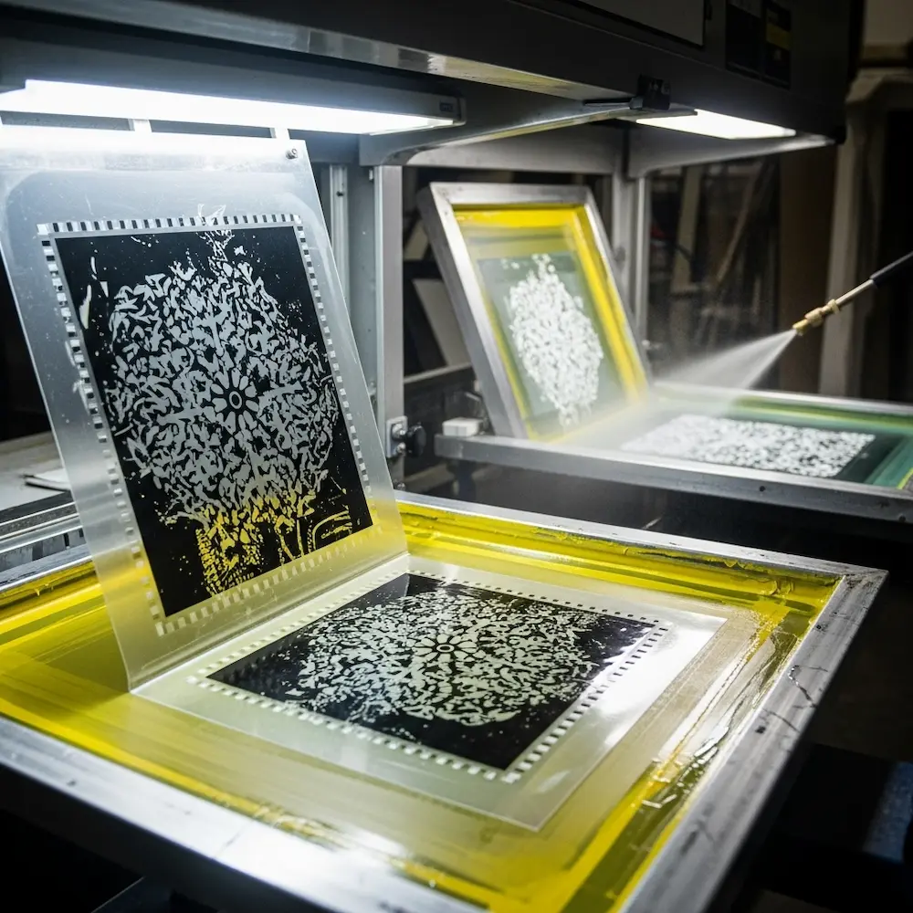
The Screen Exposure Process
Understanding screen exposure helps ensure your digital design translates successfully to physical stencils.
Coating screens with emulsion. The mesh screen gets coated with light-sensitive photoemulsion, then dried in darkness. This coating hardens when exposed to UV light but remains water-soluble where blocked from light. Weaver Screen Printing explains: “This involves coating the mesh screen with a light-sensitive emulsion and exposing it to UV light using the film positive as a stencil”.
Exposing screens through films. The film positive is placed against the emulsion-coated screen, and UV light shines through. Black areas on the film block light, leaving emulsion soft and washable in those areas. Clear areas allow light through, hardening the emulsion. Weaver continues: “The areas of the screen that are exposed to light will harden, while the areas blocked by the artwork will remain soft”. Proper exposure time (determined by emulsion type, light strength, and film opacity) is critical.
Washing out the screen. After exposure, the screen is sprayed with water, washing away unexposed emulsion and leaving open mesh in the shape of your design. “After exposure, the screen is washed with water to reveal the stencil”. This creates the actual printing stencil through which ink will be forced.
Repeat for each color in your design. A three-color design requires three separate screens, each exposed from its corresponding film positive. All screens must be exposed precisely the same size so they register correctly during printing.
Quality Control and Testing
Before production printing, verify everything transfers correctly.
Inspect screens for quality issues. Check that all fine details opened properly, no unexpected areas washed out (indicating underexposure), and the emulsion is fully hardened in areas that should be solid (indicating proper exposure). Small pinholes in emulsion can be touched up with screen filler before printing.
Test print for registration. Print all colors on a test shirt, checking that they align properly using your registration marks. Merchcraft emphasizes: “Always do a test print to check for alignment and color accuracy. Make any necessary adjustments to ensure perfect registration”. It’s far better to discover and fix registration problems on test prints than after printing fifty shirts.
Verify color accuracy if matching specific Pantone colors or brand standards. The actual printed color may vary slightly from your screen representation, so physical samples ensure expectations match reality.
Conclusion
Learning how to create a screen print design transforms abstract creative concepts into physical, wearable reality through a systematic workflow spanning concept development, digital artwork creation, color separation, file preparation, and screen production. From those early sketching decisions about color count and composition through the technical precision of trapping and registration, each step builds upon the previous one, requiring both artistic vision and technical understanding. The process rewards methodical attention to detail—proper resolution from the start, clean vector paths throughout, accurate color separation, sufficient film opacity, and correct screen exposure all contribute to final print quality.
Understanding this complete workflow—from that blank sketchbook page through the moment you wash out a screen revealing your design perfectly stenciled in the mesh—empowers you to design with the medium’s requirements in mind rather than fighting against them. The constraints become creative parameters: limited color counts encourage bold graphic solutions, spot color separations enable precise Pantone matching, and the physical printing process creates texture and vibrancy no digital method replicates. Whether you’re printing commercially or experimenting in a garage studio, mastering this systematic approach to how to make designs for screen printing ensures consistent, professional results.
For deeper exploration of specific aspects covered here, our comprehensive guide to mastering screen printing designs provides foundational principles of color separation and design requirements, our article on screen printing t-shirt designs details sizing and placement standards for apparel applications, our software guide explores the best design tools for screen printing including detailed halftone tutorials, and our creative inspiration article showcases cool screen print designs across various styles and applications. Together, these resources equip you with both the creative inspiration and technical knowledge needed to excel in screen printing design from initial concept through final production.


