
Mastering Screen Printing Designs: The Ultimate Guide to Ideas, Software, and Preparation
Table of Contents
The squeegee scraped across the mesh screen with a satisfying resistance, and I watched as vibrant red ink forced its way through the stencil onto the white cotton below. Lifting the screen revealed a crisp geometric pattern—bold lines, perfect registration, colors so saturated they seemed to glow. This was my fifteenth attempt at this particular screen printing design, and finally, everything had aligned: the artwork prepared correctly in vector format, the color separation executed with precision, the emulsion exposure timed perfectly, and the printing pressure calibrated just right. Those fourteen failed attempts had taught me what every screen printer eventually learns—that screen printing designs aren’t just pretty pictures you throw onto fabric. They’re technical blueprints that must account for ink opacity, screen mesh counts, color layering sequences, and the fundamental limitation that makes screen printing simultaneously challenging and beautiful: each color requires its own screen, its own stencil, its own precise registration. Understanding how to design for screen printing transforms frustration into mastery, turning the medium’s constraints into creative advantages that produce prints with depth, texture, and visual impact no digital printer can replicate.
Screen printing designs represent a unique intersection of artistic vision and technical precision, where creativity must work within specific constraints—limited color counts, solid ink coverage, precise registration requirements, and preparation workflows dramatically different from digital design. Unlike direct-to-garment (DTG) printing that reproduces any digital image with photographic accuracy, or heat transfer vinyl that cuts pre-colored materials, screen printing forces ink through mesh screens using physical pressure, building designs layer by layer with each color requiring separate preparation and printing. This process, essentially unchanged since its ancient origins, creates prints with unmatched vibrancy, durability, and tactile quality—but only when designs are conceived and prepared specifically for the medium’s requirements. From simple one-color logos to complex multi-color illustrations, from bold graphic t-shirt designs to subtle halftone photographic reproductions, successful screen printing designs balance artistic ambition with technical understanding, producing results that justify the medium’s continued dominance in commercial apparel printing nearly a century after modern screen printing techniques emerged.
This comprehensive guide explores screen printing designs from conceptual foundations through technical execution, covering core principles distinguishing screen printing from digital methods, essential software and tools for creating print-ready artwork, design styles and applications from t-shirts to posters, advanced techniques including halftones and simulated process color, step-by-step preparation workflows from digital file to physical screen, and practical considerations for working with print shops or establishing in-house capabilities. Whether you’re a graphic designer adapting skills to screen printing’s requirements, an entrepreneur launching a custom apparel business, a DIY creator setting up a home studio, or simply someone fascinated by how those perfectly saturated prints get onto t-shirts, this guide provides comprehensive understanding of what makes screen printing designs work technically while achieving aesthetic excellence.
Understanding Screen Printing: Process and Design Implications
Before diving into design specifics, understanding screen printing’s fundamental process illuminates why designs must be prepared differently than artwork intended for other reproduction methods.
The Screen Printing Process: From Screen to Substrate
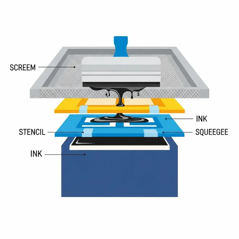
Screen printing, also called silkscreen or serigraphy, pushes ink through a mesh screen onto a substrate (typically fabric, paper, or other materials) using a rubber squeegee. The process involves several distinct stages, each with design implications.
Screen preparation begins with coating a fine mesh screen (historically silk, now typically polyester or nylon) with light-sensitive photoemulsion. Weaver Screen Printing explains: “This involves coating the mesh screen with a light-sensitive emulsion and exposing it to UV light using the film positive as a stencil. The areas of the screen that are exposed to light will harden, while the areas blocked by the artwork will remain soft”. After UV exposure through a film positive (transparent film printed with your black design), unexposed emulsion washes away, leaving open mesh in the shape of your design. This creates the stencil through which ink will pass.
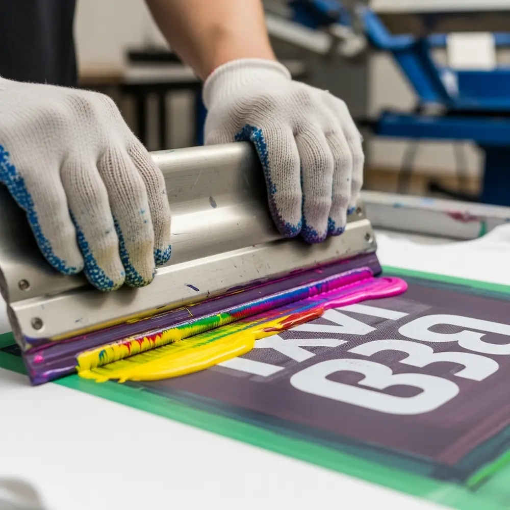
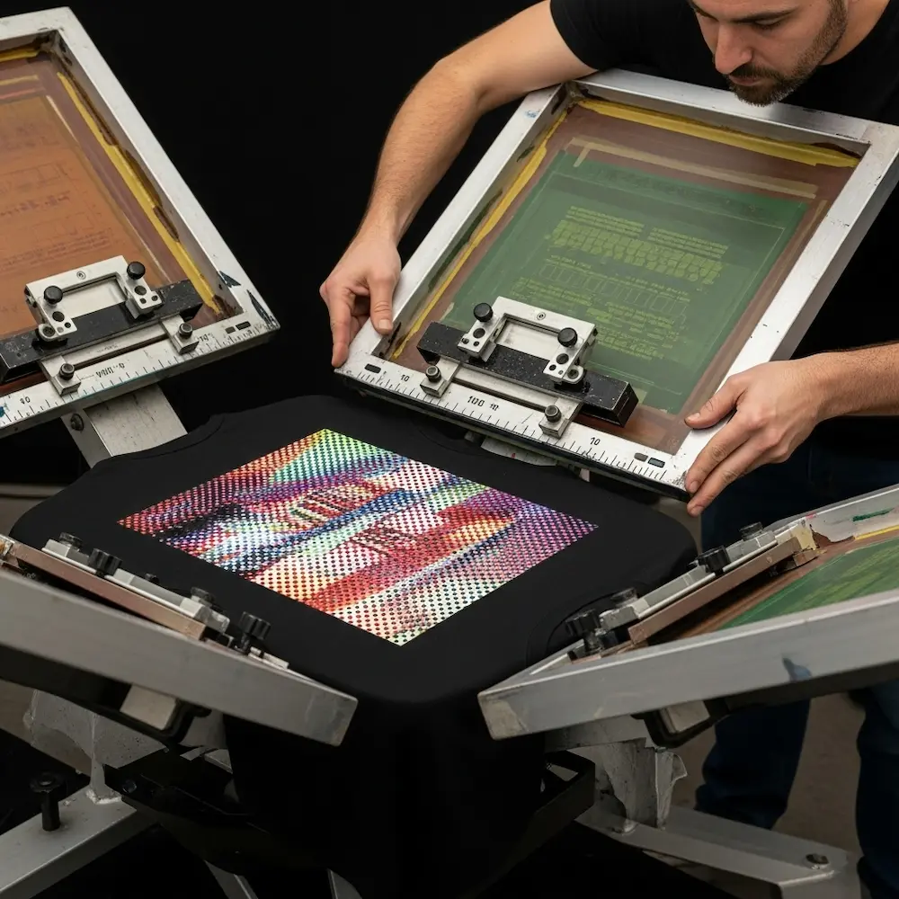
Printing execution involves securing the substrate (like a t-shirt) on a flat platen, positioning the prepared screen above it, applying ink to one edge of the screen, and pulling a squeegee across the screen with firm, even pressure. As Weaver Screen Printing describes: “A squeegee is then used to spread the ink evenly across the screen, forcing it through the stencil and onto the substrate below”. The screen lifts away, leaving ink deposited in the design’s shape. For multi-color designs, this process repeats for each color, requiring precise registration (alignment) so colors print in correct positions.
Curing completes the process by heating printed ink to specific temperatures that cause chemical crosslinking, permanently bonding ink to fabric. Proper curing ensures durability—well-cured screen prints survive dozens or hundreds of wash cycles without significant fading or cracking.
Why Screen Printing Designs Differ from Digital Graphics
The physical screen printing process creates specific design requirements and limitations that don’t exist in purely digital workflows.
Color limitation represents screen printing’s most fundamental constraint. Each color requires a separate screen with its own stencil preparation, registration, and printing pass. While digital printing reproduces millions of colors simultaneously, practical screen printing typically uses 1-6 colors (spot colors), with each additional color increasing setup time, complexity, and cost. This forces designers to simplify palettes, convert gradients to halftones, or use advanced simulated process techniques discussed later.
Registration precision matters critically in multi-color designs. Each color must align perfectly with others—misregistration by even 1-2mm creates obvious defects with visible gaps or overlaps. This requires both technical preparation (proper artwork setup with registration marks and trapping) and skilled printing execution. As Merchcraft’s color separation guide notes: “Always do a test print to check for alignment and color accuracy”.
Design resolution and detail face different limitations than digital printing. Screen mesh counts (threads per inch) limit how fine details can be—higher mesh counts capture finer detail but require thinner inks and careful technique. Small text below certain point sizes becomes illegible or fills in completely. The eGrandstand comparison notes that “small text is more legible in screen print” compared to digital printing, but only when designed appropriately for the medium. Conversely, large areas of solid color where digital printing may show banding look perfect in screen printing.
Ink opacity and layering create both challenges and opportunities. Screen printing inks sit on fabric surfaces as thick, opaque layers rather than soaking in like digital inks. This creates vibrant, saturated colors with excellent coverage on dark fabrics (often requiring underbase white layers) but also means colors don’t blend through transparency—overlapping colors create new mixed colors that must be planned intentionally.
Screen Printing vs. Digital Printing: Design Considerations
Understanding when screen printing excels versus when digital alternatives suit better helps make appropriate design and production decisions.
Screen printing advantages for design include bold solid colors with superior vibrancy and opacity, excellent coverage on dark fabrics using opaque inks, special effects inks (metallics, glow-in-dark, puff, discharge) unavailable in digital printing, durability outlasting most digital prints by significant margins, and cost efficiency for medium to large production runs (50+ pieces). The eGrandstand analysis concludes: “Screen printing’s strength is large area of a single color”.
Digital printing advantages include unlimited color palettes without setup cost increases, photographic detail and smooth gradients, cost efficiency for very small runs (1-25 pieces), faster turnaround without screen preparation time, and design flexibility enabling last-minute changes. The xTool comparison notes: “Digital printing is best at producing detailed, multi-colored designs. It is ideal for producing personalized designs and small-scale production”.
Design style recommendations emerge from these technical differences. Bold graphics with 1-4 colors suit screen printing perfectly—think vintage band posters, corporate logos, athletic team uniforms, and graphic streetwear. Complex photographic images, full-color illustrations with dozens of hues, and ultra-detailed designs with tiny elements often work better digitally unless using advanced simulated process screen printing. Understanding these distinctions guides design decisions from the earliest conceptual stages.
Core Principles of Screen Printing Design
Successful screen printing designs follow specific principles addressing the medium’s technical requirements while maximizing its aesthetic strengths.
Color Separation: The Foundation of Multi-Color Designs
Color separation—breaking designs into individual spot colors, each printed from its own screen—represents screen printing’s most critical technical requirement. Merchcraft’s comprehensive guide defines it: “Color separation for screen printing involves breaking the image into separate color components”.
Spot color separation works for designs with distinct, non-overlapping colors. Each color in the artwork becomes one screen, printed in sequence. A three-color design (say, red, blue, and yellow) requires three screens—one exposing red areas, one for blue, one for yellow. This straightforward approach works perfectly for logos, text-based designs, and graphic illustrations with clear color boundaries.
Trapping and choking prevent registration issues in spot color designs. Trapping slightly overlaps adjacent colors so minor misregistration doesn’t create visible gaps. Choking slightly reduces one color’s area where it meets another. The Reddit screen printing discussion recommends: “Apply a 1 pt choke (set to mid if using vector) or a 2-pixel choke at 300 DPI in Photoshop on the areas beneath the red flaming text”. These techniques, applied subtly (1-2 pixels), create forgiving designs that print cleanly even with imperfect registration.
Halftone separation converts continuous tone images (photographs, gradients) into patterns of dots printable in screen printing. Since screen printing can’t vary ink density like digital printing, halftones simulate shading through dot sizes—larger dots appear darker, smaller dots lighter, with substrate showing through creating mid-tones. Merchcraft advises: “For detailed images, convert colors into halftones to ensure smooth gradients”. This technique enables photographic screen printing but requires careful dot size and screen mesh selection to avoid moiré patterns.
Simulated process color separation creates full-color photographic effects using multiple spot color screens. The Shop Strange guide explains: “Simulated process printing requires careful color selection and precise registration. Printers often use specialized software to generate color separations and determine optimal ink combinations”. This advanced technique analyzes images, breaks them into 4-7 strategically chosen spot colors (not CMYK), generates halftone screens for each, and prints them in specific sequences to simulate continuous tone photography. Key steps include “image analysis and color separation,” “halftone screen creation,” “color mixing and ink formulation,” and “sequential printing of color layers”. While technically demanding, simulated process achieves photographic results within screen printing’s framework.
Design Resolution and File Preparation Standards
Proper resolution and file setup prevent quality issues from concept through printing.
Resolution requirements for screen printing differ from screen display. While 72 DPI suits web graphics, screen printing demands 300 DPI minimum for raster images and halftones. This ensures sufficient detail survives the screen burning process and produces clean prints without visible pixelation. The Reddit discussion specifically mentions “2-pixel choke at 300 DPI” as standard practice. Vector artwork, when possible, avoids resolution concerns entirely by defining shapes mathematically rather than through pixels.
Color mode specifications must match screen printing workflows. Designs should use spot colors (Pantone or custom mixed inks) rather than process CMYK unless specifically using CMYK or simulated process separation. Each spot color in the digital file becomes one physical screen and ink. Proper color mode setup ensures what designers see on screen translates accurately to physical inks.
File formats and specifications for screen printing favor certain standards. Vector formats (AI, EPS, PDF with vectors) provide maximum flexibility and scale infinitely without quality loss. High-resolution raster formats (PSD, TIFF at 300+ DPI) work for photographic elements requiring halftone conversion. Files should include all fonts (converted to outlines or embedded), spot color swatches clearly labeled, registration marks for multi-color designs, and sufficient bleed area beyond trim edges.
Designing for Different Substrates and Ink Types
Fabric type and ink selection significantly impact design decisions.
Light vs. dark fabric considerations affect color choices and underbasing requirements. Light-colored fabrics (white, natural, pastels) allow direct printing of most ink colors with good visibility. Dark fabrics (black, navy, dark heather) require opaque inks or underbase white layers to prevent the fabric color from showing through and muting design colors. Designs for dark fabrics often need an additional white underbase screen printed first, then color layers on top—effectively adding a “color” to the separation even though it won’t be visible in the final design.
Ink type selection influences design aesthetics and preparation. Plastisol inks (PVC-based) sit on fabric surfaces, offering brilliant colors, easy printing, and special effect options but creating a thicker hand feel. Water-based inks soak into fabric fibers, creating soft prints that feel like part of the shirt but requiring more skill to print and offering less opacity on dark fabrics. Discharge inks remove fabric dye and replace it with new color, creating ultra-soft prints on dark shirts but only working on 100% cotton with reactive dyes. Each ink type affects how designs should be prepared and what effects are achievable.
Special effects and techniques expand creative possibilities. The Family Industries guide lists advanced techniques including “halftone printing, discharge printing, foil printing” and others. Metallic inks add shimmer, puff inks create raised three-dimensional effects, glow-in-the-dark inks provide novelty, and high-density printing builds thick ink deposits for dimensional logos. The xTool comparison notes that “for inks that shine, sparkle, or glow, screen printing is the better choice”. Designing for these effects requires understanding their technical requirements and visual impact.
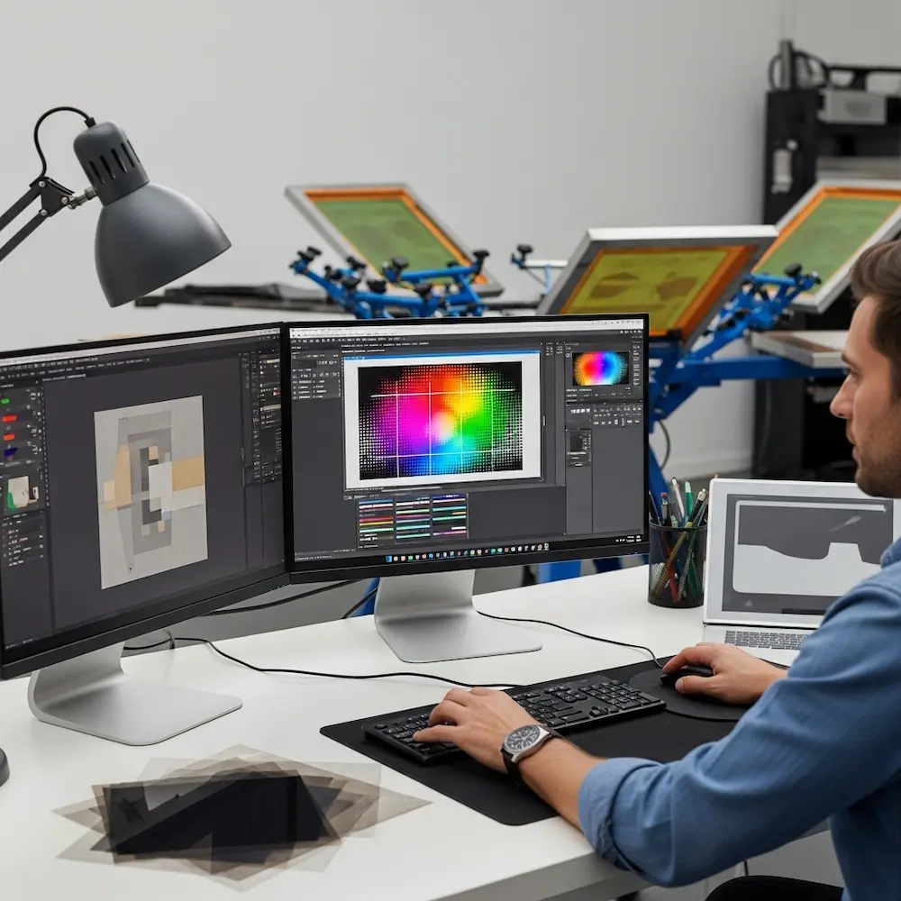
Essential Tools and Software for Screen Printing Design
Creating print-ready screen printing designs requires appropriate software and understanding how to use digital tools for physical printing workflows. Our detailed article on the best design software for screen printing explores this comprehensively, but key principles deserve overview here.
Vector vs. Raster: Choosing the Right Tool
Different design elements require different software approaches.
Vector graphics software (Adobe Illustrator, Affinity Designer, CorelDRAW, Inkscape) excels for most screen printing design work. Vector graphics define shapes mathematically rather than through pixels, allowing infinite scaling without quality loss—critical when designs might print on anything from business cards to banners. Vector software naturally creates the clean, defined edges screen printing reproduces best. Logos, text, graphic illustrations, and geometric patterns all start as vectors.
Raster graphics software (Adobe Photoshop, GIMP, Affinity Photo) handles photographic content and creates halftones. While vectors define shapes, rasters work with pixels—appropriate for photographs, textures, and continuous tone images requiring halftone conversion for screen printing. The Reddit discussion describes “doing an Index Separation using Photoshop” for photographic screen printing designs. Raster software also generates halftone screens at specified line frequencies and dot sizes.
Hybrid workflows combine both tool types for optimal results. A typical screen printing design might start with vector graphics for text and solid shapes, import raster photographs converted to halftones, and combine everything in vector software for final color separation and output. Understanding each tool’s strengths enables efficient workflows.
Color Separation Software and Plugins
Specialized tools simplify the complex color separation process.
Separation software options range from manual techniques to automated solutions. Professional screen printers often use dedicated separation programs that analyze images, recommend color counts, generate optimized spot color separations, and create halftone screens automatically. The Shop Strange guide notes printers “often use specialized software to generate color separations and determine optimal ink combinations”. These tools dramatically reduce separation time while improving quality.
Manual separation techniques in standard graphics software offer more control. Designers can manually separate colors by creating layers for each ink color, drawing or selecting areas for each color, and ensuring proper trapping between colors. While time-consuming, manual separation provides absolute control over the result and works in any standard graphics program.
Output Requirements: Creating Film Positives
The final design file must become physical film positives for screen burning.
Film positive specifications require specific output characteristics. Each color in the design prints as a separate film positive—transparent film with opaque black areas defining where that color should print. Merchcraft instructs: “Print each separated color onto transparent film to create your screens”. Films must be completely opaque in black areas (to block UV light during exposure) and completely clear in open areas. Insufficient opacity creates weak stencils that break down during printing.
Printing film positives can use several methods. Professional imagesetters produce highest quality films with dense blacks and crisp edges. Desktop inkjet printers with pigment-based black ink on transparency film work for DIY setups, though multiple print passes may be needed to achieve sufficient opacity. Laser printers produce denser blacks than most inkjets but can’t use true transparency film. Some printers output designs on paper then make contact exposures to create final film positives.
Screen Printing Design Styles and Applications
Screen printing’s technical characteristics suit certain design aesthetics particularly well. Understanding successful styles guides creative decisions from the earliest concept stages.
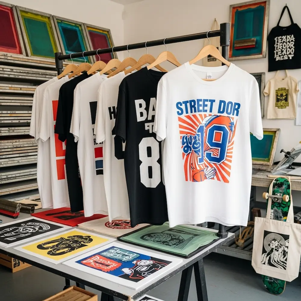
T-Shirt Designs: The Dominant Application
T-shirt printing represents screen printing’s largest commercial application, with design conventions developed over decades. Our comprehensive article on screen printing t-shirt designs explores this in depth, including placement guidelines, sizing standards, and style-specific considerations.
Bold graphic styles dominate successful t-shirt screen printing. Vintage band merchandise aesthetics with distressed textures and limited colors, streetwear graphics featuring large-scale text and geometric patterns, athletic designs with team names and bold numbers, and retro-inspired illustrations with hand-drawn character all leverage screen printing’s strength in solid, saturated colors. These styles work within typical 1-4 color counts while achieving strong visual impact.
Typography-focused designs showcase screen printing’s ability to reproduce crisp letterforms. The medium excels at bold sans-serif fonts, hand-lettered styles with thick strokes, and decorative display faces—all printed with perfect edge definition. Text-based designs often work as single-color prints, maximizing cost efficiency while maintaining aesthetic impact. Small text below 6-8 points requires careful consideration of legibility in screen printing.
Design placement and sizing follow established conventions detailed in our t-shirt-specific article. Standard chest prints typically range 11-14 inches wide, back prints can span 12-14 inches, and sleeve prints run smaller at 3-4 inches. Proper sizing ensures designs look proportional on various garment sizes. Placement affects both aesthetics and printing logistics—designs too close to seams or collars can be difficult to print cleanly.
Poster and Art Print Designs
Screen printed posters represent the medium at its artistic peak, with design traditions spanning from mid-century concert posters to contemporary limited edition art prints.
Vintage poster aesthetics established screen printing’s artistic credentials. Psychedelic rock posters with hand-drawn letterforms and vibrant color overlays, propaganda-style graphics with bold shapes and limited palettes, and travel posters featuring geometric simplification of photographic subjects all originated in or were perfected through screen printing. These styles embrace the medium’s characteristics—accepting color limitations as aesthetic choices rather than technical constraints.
Contemporary poster design continues screen printing traditions while incorporating modern influences. Limited edition art prints often use 3-6 colors to create complex images through strategic color overlays, specialty inks (metallics, fluorescents) for visual effects unavailable in offset printing, and hand-finished elements like embossing or foil stamping. The Shop Strange guide notes that screen printing “methods allow for unique artistic effects”. These designs celebrate screen printing’s handmade quality.
Specialized Applications Beyond Apparel
While t-shirts dominate, screen printing adapts to numerous other substrates and applications.
Product decoration uses screen printing for diverse items. Tote bags, patches, stickers, skateboards, and promotional products all commonly feature screen printed designs. Each substrate presents unique considerations—stickers require inks adhering to vinyl or paper with aggressive adhesives, skateboards need flexible inks surviving impacts and abrasion, and bags may use water-based inks for soft hand feel. Understanding substrate-specific requirements ensures design success.
Signage and industrial printing represents screen printing’s non-garment commercial applications. Large format signs, control panels with legends and graphics, printed circuit boards, and architectural glass all use screen printing processes. These applications prioritize durability, precision, and often use specialized inks like ceramics or conductive materials rather than standard plastisol. The basic design principles—color separation, proper resolution, clean artwork—remain consistent across applications.
Advanced Techniques: Halftones and Simulated Process
Moving beyond simple spot color designs opens sophisticated screen printing capabilities approaching photographic quality.
Halftone Screen Printing: Creating Tonal Range
Halftone techniques allow screen printing to reproduce photographs, portraits, and continuous tone artwork by converting smooth gradients into patterns of dots.
Halftone fundamentals adapt traditional print reproduction to screen printing. The technique breaks images into dots of varying sizes—larger dots in darker areas, smaller dots in highlights, with substrate color showing through to create perceived gray tones or tints. Line frequency (lines per inch or LPI) determines dot size and detail level—higher frequencies capture finer detail but require finer mesh screens and more careful printing technique. Typical screen printing uses 35-55 LPI compared to 150+ LPI in offset printing.
Single-color halftone printing creates monochromatic photographic images. Black ink on white shirts produces classic photographic reproduction, while colored inks create duotone effects. The Family Industries guide explains this is one of the “different types of screen printing techniques” enabling photographic results. Single-color halftones offer relatively simple preparation—convert images to grayscale, apply halftone screen at appropriate frequency, and output film positive.
Multi-color halftone printing layers multiple halftone screens to create full-color effects. Traditional CMYK process uses four screens (cyan, magenta, yellow, black) with each printed at different angles to prevent moiré interference patterns. Each color uses halftone dots varying in size to control its intensity. While theoretically similar to offset CMYK printing, screen printing CMYK faces challenges with dot size limitations and registration precision. As a result, simulated process techniques often work better for full-color photographic screen prints.
Simulated Process Color: Photographic Screen Printing
Simulated process represents screen printing’s most advanced technique for reproducing photographic images and complex artwork with full color depth.
Simulated process principles differ fundamentally from CMYK. Rather than using standard cyan, magenta, yellow, and black inks in halftone screens, simulated process analyzes the specific image being printed, determines 4-8 optimal spot colors to reproduce that particular image, and creates custom halftone separations for each chosen color. The Shop Strange guide explains: “Successful simulated process printing requires careful color selection and precise registration”. Colors might include navy blue, rust orange, warm gray, and cream—whatever combination best reproduces the specific image.
Separation workflow for simulated process requires specialized knowledge or software. The process includes analyzing the image to identify dominant colors and tonal ranges, selecting 4-8 spot colors that will mix optically to create the image, generating halftone separations showing where and how much of each color to print, determining printing sequence (usually light to dark), and creating film positives for each color. The Shop Strange guide details these “key steps in simulated process printing” including “image analysis and color separation,” “halftone screen creation,” and “color mixing and ink formulation”.
Printing execution demands precision exceeding simple spot color work. Each halftone screen must register perfectly with others—1mm misregistration that might be acceptable in spot color designs ruins simulated process prints. Ink consistency, squeegee pressure, and screen tension must remain consistent across all colors. The Shop Strange guide notes the importance of “fine-tuning print parameters for optimal results”. When executed well, simulated process creates photographic screen prints indistinguishable from photographs at typical viewing distances.
From Concept to Screen: The Design Preparation Workflow
Creating screen-ready artwork follows a systematic workflow from initial concept through final film output. Our dedicated article on how to create a screen print design covers this process step-by-step in comprehensive detail.
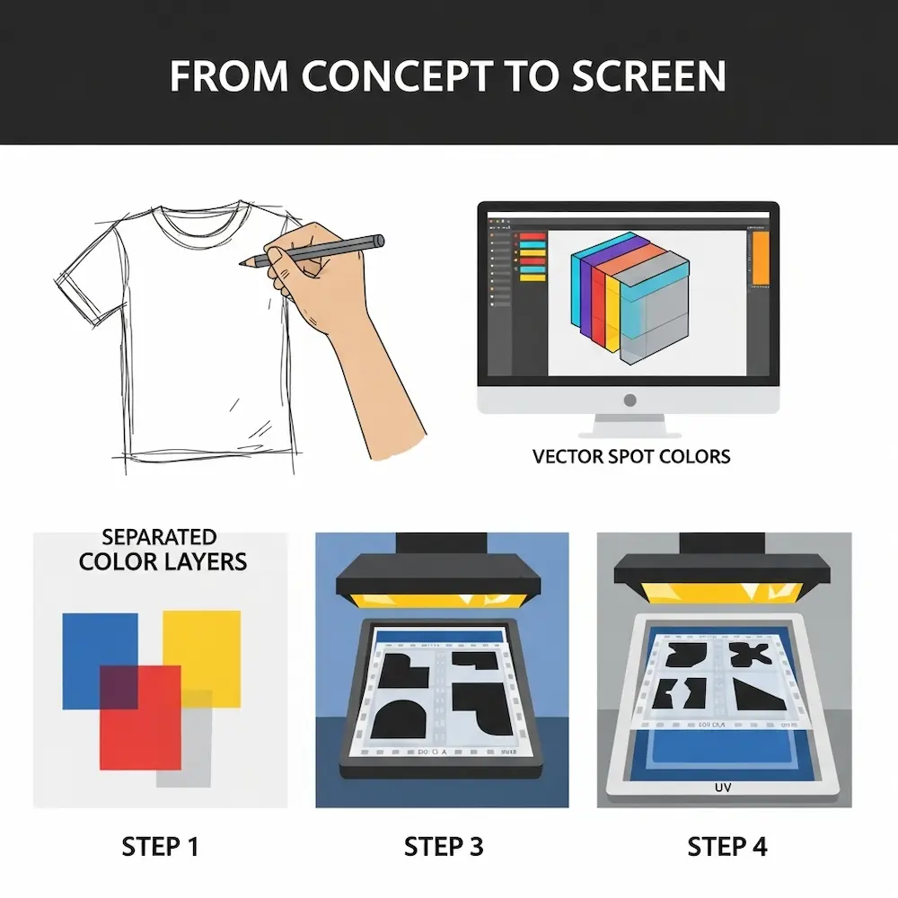
Step 1: Concept Development and Sketching
Every successful screen printing design starts with clear concept grounded in the medium’s characteristics.
Initial sketching establishes composition, elements, and general aesthetic. Early sketches should consider color count limitations—how many colors are viable given budget and complexity tolerance?. Designs work best when conceived with screen printing in mind from the start rather than trying to adapt complex digital artwork later. Weaver Screen Printing notes that the process begins with “designing the artwork”—this foundational stage determines ultimate success.
Style and color decisions made during concept stage impact all subsequent work. Will the design use bold graphics or photographic elements? Simple solid colors or halftones and gradients? Light or dark garments? These decisions dictate preparation approaches and set realistic expectations. Our article on cool screen print designs explores various aesthetic directions and their technical requirements.
Step 2: Digital Artwork Creation
Translating concepts into digital artwork requires appropriate software and techniques.
Vector illustration for graphic elements ensures clean, scalable artwork. Creating shapes, text, and line art in vector software produces mathematically defined elements that scale infinitely and output at any resolution. Designs should use spot colors from the start, with each color on separate layers for easier separation later. Clean vector artwork with well-defined shapes simplifies color separation dramatically.
Photographic elements require conversion to halftones if included. Source photographs should be high resolution (300 DPI minimum at final print size). Images get converted to appropriate color modes (grayscale for single-color halftones, or separated into component colors for multi-color halftone printing). Merchcraft advises: “For detailed images, convert colors into halftones to ensure smooth gradients”. Proper halftone conversion determines whether photographic elements print cleanly or create messy, unclear results.
Step 3: Color Separation and Trapping
Separating multi-color designs into individual screens requires technical precision.
Manual separation in graphics software works for simple designs. Create one layer per ink color, with artwork elements assigned to appropriate layers. Adjacent colors should include slight trapping or choking to forgive minor registration errors. The Reddit discussion recommends specific values: “Apply a 1 pt choke (set to mid if using vector) or a 2-pixel choke at 300 DPI”. Each separated color exports as an individual file for film output.
Automated separation using specialized software speeds the process for complex designs. Professional separation programs analyze artwork, suggest optimal color counts and separations, automatically generate trapping, and output print-ready files. While expensive, these tools pay for themselves quickly in commercial screen printing operations handling dozens of designs weekly.
Step 4: Film Output and Screen Preparation
Digital files become physical screens through film positives and photochemical exposure.
Creating film positives outputs each separated color as transparent film with opaque black defining the stencil. Merchcraft instructs: “Print each separated color onto transparent film to create your screens”. Films must have completely opaque blacks for proper UV blocking during exposure. Registration marks printed on each film ensure colors align during printing.
Screen exposure creates the actual stencils. As described earlier, emulsion-coated screens are exposed to UV light through film positives. Weaver Screen Printing details: “The areas of the screen that are exposed to light will harden, while the areas blocked by the artwork will remain soft. After exposure, the screen is washed with water to reveal the stencil”. Proper exposure time, light intensity, and washout technique all affect stencil quality.
Working with Screen Printers and Print Shops
Unless establishing in-house printing capabilities, most designers work with commercial screen printers to execute their designs. Understanding print shop requirements and communication facilitates successful collaborations.
Providing Print-Ready Files
Screen printers have specific file requirements ensuring smooth production.
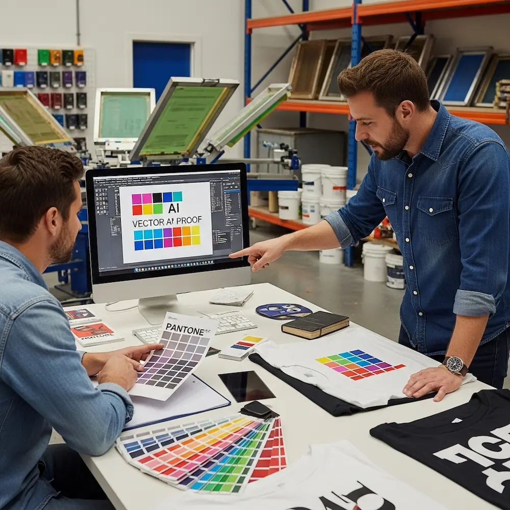
File format specifications typically include vector files (AI, EPS, or PDF with vectors preserved) for graphic elements, high-resolution raster files (PSD or TIFF at 300+ DPI) for photographic content, spot color definitions with Pantone codes or exact ink formulas, and all fonts converted to outlines or embedded. Some printers prefer pre-separated files with one file per ink color, while others separate colors in-house from composite artwork. Confirming format preferences before beginning work prevents delays.
Color specifications and ink matching require clear communication. Providing Pantone codes ensures consistent color reproduction, though screen printers may need to adjust formulas for specific fabrics or inks. Supplying printed color samples or swatches helps printers match colors accurately. For simulated process or other complex color work, discussing separation approach with the printer before finalizing artwork ensures feasibility.
Proofing and approvals prevent costly mistakes. Merchcraft recommends: “Always do a test print to check for alignment and color accuracy. Make any necessary adjustments to ensure perfect registration and color fidelity”. Many printers offer digital proofs showing how the design will appear, though these don’t capture ink texture, color accuracy on fabric, or registration precision. Physical sample prints, while adding cost, provide definitive approval for important projects.
Understanding Pricing and Minimums
Screen printing economics differ dramatically from digital printing, with setup costs favoring larger quantities.
Setup costs include screen preparation, color mixing, and press setup time. These fixed costs occur regardless of quantity printed. As a result, screen printing becomes cost-effective typically around 50+ pieces, with per-unit costs decreasing substantially as quantities increase. The comparison between screen printing and digital printing shows this clearly—digital printing’s zero setup costs suit small quantities, while screen printing’s economies of scale favor larger runs.
Per-color pricing means more colors increase costs significantly. Each additional color requires another screen, more setup time, and additional printing passes. A four-color design costs considerably more than a two-color design, all else equal. This pricing structure encourages designs with limited color counts. Understanding this helps designers balance aesthetic ambitions with budget realities.
Conclusion
Screen printing designs exist at the intersection of artistic creativity and technical precision, where understanding the medium’s constraints enables designs that leverage its unique strengths—vibrant colors with unmatched opacity and durability, tactile ink deposits creating physical texture, and aesthetic character impossible to replicate through purely digital means. From the fundamental process requiring separate screens for each color through color separation techniques breaking complex artwork into printable components, from software selection and file preparation workflows to advanced techniques like halftones and simulated process, successful screen printing designs emerge from knowledge applied throughout the creative and technical process.
The principles explored here—designing within color count limitations, preparing artwork for physical printing rather than screen display, understanding how ink behaves on fabric, and working within registration tolerances—distinguish effective screen printing designs from digital graphics that look impressive on monitors but fail in physical production. Whether creating bold t-shirt graphics that dominate streetwear and band merchandise, artistic screen print posters in limited editions, or specialized applications across diverse substrates, mastering screen printing design principles transforms technical limitations into creative advantages that define the medium’s enduring appeal.
For specific applications, our comprehensive cluster articles provide detailed guidance: screen printing t-shirt designs explores garment-specific considerations including placement, sizing, and style conventions; best design software for screen printing reviews tools and techniques for creating print-ready artwork including advanced halftone tutorials; how to create a screen print design walks through the complete workflow from initial concept to physical screens; and cool screen print designs showcases style variations and provides inspiration across applications. Together, these resources provide complete understanding of screen printing designs from foundational principles through specialized applications, ensuring your designs achieve both aesthetic excellence and technical success in this demanding yet rewarding medium.


