
Screen Printing T-Shirt Designs: Ideas, Placement, and Technical Specifications
Table of Contents
I held the freshly printed t-shirt at arm’s length, squinting at the design placement with growing frustration. The artwork itself was perfect—bold three-color graphic with crisp registration, vibrant inks properly cured. But the placement was disastrously wrong. What should have been a centered chest print sat two inches too low, creating an awkward gap between collar and design that made the whole shirt look amateurish. Worse, I’d printed fifty shirts before catching the error, representing hours of work and hundreds of dollars in materials. That expensive lesson taught me what every experienced screen printer knows: creating great screen printing t-shirt designs requires far more than artistic talent. Technical specifications matter enormously—proper sizing for different garment sizes, precise placement measurements varying by print location, understanding how designs translate differently on light versus dark fabrics, and accounting for fabric stretch and printing limitations. The most beautiful artwork in the world becomes waste if positioned incorrectly or sized inappropriately for the garment. Mastering t-shirt screen printing design means mastering both creativity and technical precision, ensuring designs don’t just look good on screen but work perfectly in physical production.
Screen printing t-shirt designs represent the medium’s dominant commercial application, with design conventions refined over decades of apparel production. Unlike designs intended for posters, signs, or other flat surfaces, t-shirt designs must account for three-dimensional garment construction, fabric stretch and drape, varying garment sizes requiring design scaling, print location conventions determining where designs can be placed, and the fundamental difference between printing on light-colored versus dark-colored fabrics. These technical requirements shape aesthetic decisions from the earliest concept stages—a design that works beautifully as a large full-front print may fail completely as a small left-chest logo, while artwork perfect for white shirts might require complete color revision for black garments. Understanding these t-shirt-specific considerations distinguishes designs that translate successfully to wearable products from digital artwork that exists only on screens.
This comprehensive guide explores screen printing t-shirt designs from creative inspiration through technical execution, covering design style ideas and trends in t-shirt graphics, precise placement guidelines and sizing standards for various print locations, technical requirements for different fabric colors and types, creating effective designs within screen printing’s constraints, and practical considerations for working with print shops or managing in-house production. Whether you’re launching a custom apparel brand, designing merchandise for bands or organizations, creating one-off artistic wearables, or simply understanding how those perfect prints get positioned on shirts, this guide provides the technical knowledge and creative inspiration needed for successful screen print t-shirt designs. As explored in our pillar article on mastering screen printing designs, understanding medium-specific requirements transforms general design skills into apparel-ready expertise.
T-Shirt Design Ideas and Creative Inspiration
Successful screen printing t-shirt designs balance aesthetic impact with technical feasibility, embracing styles that leverage screen printing’s strengths while working within its limitations.
Bold Graphics and Limited Color Palettes
Screen printing excels at designs with solid colors and clear boundaries, making bold graphic styles naturally suited to the medium.
Vintage and retro aesthetics dominate contemporary t-shirt screen printing. Distressed textures suggesting worn vintage prints, limited color palettes (often 2-3 colors) creating nostalgic feel, hand-drawn letterforms with organic imperfections, and period-appropriate imagery referencing 60s-80s design styles all leverage screen printing’s characteristics. These designs embrace visible texture and ink deposits that digital printing tries to minimize. The Broken Arrow Wear design template gallery showcases how “our t-shirt design ideas template tool” enables “customizable t-shirt design idea templates for screen printing” in vintage styles.
Streetwear and graphic tees feature bold geometric compositions and typography-driven designs. Large-scale text with minimal accompanying imagery, abstract geometric patterns creating visual interest through shape alone, pop culture references rendered in simplified graphic styles, and oversized prints extending across entire shirt fronts all work effectively in screen printing. These designs prioritize immediate visual impact over subtle detail.
Illustrative and hand-drawn styles bring artistic character to t-shirt screen printing. Cartoon characters and mascots with bold outlines and limited colors, organic hand-drawn elements contrasting with geometric typography, decorative borders and frames containing central imagery, and nature-inspired motifs (flora, fauna, landscapes) rendered graphically all translate well to screen printing’s aesthetic. The key is maintaining bold forms and avoiding excessive fine detail that screen printing struggles to reproduce.
Typography-Focused T-Shirt Designs
Text-based designs represent screen printing’s most straightforward application while offering tremendous creative range.
Single-color text designs maximize cost efficiency while maintaining impact. Bold sans-serif fonts creating strong visual presence, decorative display faces with character and personality, hand-lettered custom typography adding uniqueness, and strategic text arrangement creating compositional interest all work as affordable one-color prints. Screen printing reproduces crisp letterforms with perfect edge definition, making typography-focused designs particularly successful.
Text and graphic combinations add visual interest while controlling color count. Simple icons or badges incorporating text elements, decorative rules and flourishes enhancing typography, text arranged in geometric shapes or patterns, and minimal illustrative elements supporting textual messages all create more complex designs while remaining within 2-3 color budgets typical of screen printing. Broken Arrow Wear notes their templates work for “race wear, business logos, fundraisers, booster clubs, youth camps, team sports” and other text-heavy applications.
Specialized T-Shirt Design Categories
Certain t-shirt categories have established design conventions and expectations.
Sports and athletic designs feature team-oriented graphics and bold numbers. Team names in large athletic lettering, player numbers as dominant design elements, mascots and school/team emblems, and athletic-inspired geometric patterns all characterize sports apparel screen printing. These designs typically use 2-3 colors matching team colors and prioritize legibility and bold presence over artistic subtlety.
Band and music merchandise embraces darker aesthetics and photographic elements. Tour dates and venue listings in structured layouts, band photos converted to high-contrast or halftone prints, gothic or grunge typography matching musical genres, and dark color schemes (black shirts with white/colored designs) all typify music merchandise. These designs often push screen printing’s technical limits with detailed photographic content requiring halftone or simulated process techniques.
Corporate and promotional apparel prioritizes branding clarity and professional appearance. Company logos reproduced accurately in spot colors, taglines and marketing messages in clean typography, event-specific graphics for conferences or trade shows, and professional aesthetics avoiding overly casual or edgy styles all characterize corporate screen printing. These designs emphasize perfect color matching (often to established brand Pantone colors) and consistent reproduction across large quantities.
Design Placement Guidelines: Where Designs Belong
Proper placement transforms good artwork into great t-shirts—incorrect positioning makes even perfect designs look amateurish. Industry standards exist for good reason, based on decades of trial and error determining what looks balanced and professional.
Full Front and Center Chest Placement
Front designs offer maximum visibility and several distinct placement options.
Center chest placement positions designs in the upper center of the shirt front. Printful’s comprehensive guide specifies: “Position the design 3″ to 3.5″ below the collar. A standard size ranges from 6″ × 6″ to 10″ × 8″, with 8″ x 8″ being most common”. Printify adds that this placement “is ideal for branding and subtle visuals” and works “particularly well for smaller shirt sizes”. Center chest creates balanced, traditional appearance suitable for logos, text-based designs, and smaller graphics. As Printful notes: “For symmetry, align your design with the collar’s center”.
Full front placement extends from just below collar to mid-torso or lower. Printify describes this as “the most versatile option for larger design placements” with “average size range: 10″-14″ wide and 6″-5″ tall”. Full front designs make bold statements and suit detailed artwork requiring larger scale. Printful specifies that “for direct-to-garment printing, the maximum placement size is 10″ × 12″ to 12″ × 16″ depending on the product”, though screen printing faces similar practical limits based on press platen sizes. This placement works best for graphic tees, artistic designs, and statements requiring visual impact.
Oversize front placement creates contemporary streetwear aesthetic. Printify defines oversize prints as “starting two to three inches below the collar and extending to the bottom hem”. This dramatic placement “is best for oversized adult t-shirts, as smaller shirts won’t effectively accommodate the design’s size”. Oversize designs require careful consideration of garment proportions and printing capabilities.
Left Chest and Pocket Placement
Small front prints create subtle branding opportunities and professional appearance.
Left chest placement positions small designs in the upper left quadrant. The Screen Printing resource guide specifies: “A good rule of thumb is to keep the chest print under 4″. Many printers prefer 3″-3.5″”. The guide continues: “While left chest prints are generally on the left chest (what a surprise), some customers prefer the right chest over the left. Either way, the center of the design should be about 3.5″ from the center of the shirt”. Printful adds placement specifics: “Position the design about 3 inches (7 cm) below the neckline and 2 inches (5 cm) from the armpit”. This traditional placement suits corporate apparel, polo shirts, and understated branding.
Pocket placement when shirts have actual chest pockets requires adjusting for pocket presence. Designs must be sized and positioned to work harmoniously with or replace pocket graphics. The Instructables DIY guide describes printing “a smaller image of the logo only, on the front breast pocket area of the shirt. The small logo is about 2.5 inches across”, demonstrating typical pocket-area scaling.
Back Placement and Full Back Designs
Back designs offer large canvas for detailed or bold graphics.
Center back placement provides maximum space for complex designs. Standard back prints typically measure 10-14 inches wide, positioned 2-3 inches below the collar. This placement suits band merchandise, team jerseys with player names/numbers, artistic designs requiring detail, and bold graphics making statements. The Instructables guide specifies creating frames where “the adult size frame is 16″x16″, the youth frame is 12″x12″” for back designs, showing how sizing must accommodate different garment scales.
Full back placement extends designs across entire back area. Similar to full front, these designs make maximum impact and suit detailed artwork, event rosters or participant lists, artistic statements requiring large scale, and dramatic graphics. Positioning must account for collar and avoid extending too low where sitting would obscure designs.
Sleeve and Other Alternative Placements
Beyond standard front and back, sleeves and other locations offer creative placement options.
Sleeve placement positions small designs on upper arms. Printful notes: “At Printful, the standard max sleeve placement size is most often 4″ × 3.5″, but some all-over print products have a maximum size of around 20″ × 12″”. Standard sleeve prints work for secondary branding, decorative elements supporting main designs, military-style patches or badges, and sports numbers. Printful warns: “Since sleeve sizes vary greatly depending on the t-shirt size and the manufacturer, before you start designing, make sure to figure out: If your desired product offers a sleeve design placement”.
Alternative placements include nape (back of neck), side panels, bottom hem, and other unconventional locations. These creative placements suit artistic or fashion-forward designs pushing conventional boundaries. However, non-standard placements may increase printing difficulty and cost due to specialized equipment or setup requirements.
Sizing Standards for Different Garment Sizes
Designs must scale appropriately across garment size ranges from youth small to adult 5XL. One-size-fits-all rarely works—designs properly sized for medium shirts look too small on 3XL or too large on youth sizes.
Scaling Designs Across Size Ranges
Professional screen printers adjust design sizing based on garment dimensions.
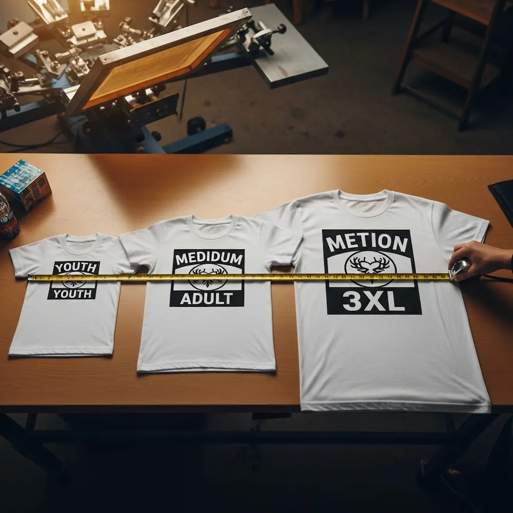
Adult vs. youth sizing requires different design scales. The Instructables guide describes creating two different screen sizes: “The main image is about 12 inches across for the adult sized shirts and about 9 inches across for the youth sized shirts”. This approximately 25% reduction maintains proper proportions on smaller garments. The guide explains the reasoning: “Trying to use one size for both just didn’t look right in my samples”.
Adjusting for extended sizes (XL, 2XL, 3XL and up) may require enlarging designs. The Screen Printing guide notes: “T-shirts come in all sizes, from XS to 5XL. Consider these sizing changes when they come up. In some cases, you may need to enlarge or shrink the design to make it better fit the garment”. However, the guide recommends practical approaches: “Adjusting your platen to accommodate the proper print placement is often easier than adjusting the screen. Keep the screen registered and slide the platen in or out, depending on the size of the shirt”. This technique maintains design size while adjusting placement for garment proportions.
Maintaining Proportions and Balance
Well-sized designs maintain visual balance regardless of garment size.
Proportional relationships between design and garment matter more than absolute measurements. A 12-inch design on a small shirt appears much larger (relatively) than the same 12-inch design on 3XL. Professional designers consider how designs will look across the full size range, sometimes creating 2-3 different size variations for small, medium/large, and extended sizes. This ensures consistent visual impact regardless of who wears the shirt.
Testing sizing decisions before production prevents expensive mistakes. Creating physical mockups or sample prints on actual garments across the size range reveals scaling issues invisible in digital layouts. As my opening anecdote illustrates, catching placement and sizing errors after printing fifty shirts costs far more than making a few test prints beforehand.
Technical Requirements: Light vs. Dark Fabrics
Fabric color dramatically affects design preparation, printing technique, and achievable results. Understanding these differences guides color choices and technical approaches from the earliest design stages.
Printing on Light-Colored T-Shirts
Light fabrics (white, natural, pastels, heathers) offer straightforward printing with excellent color reproduction.
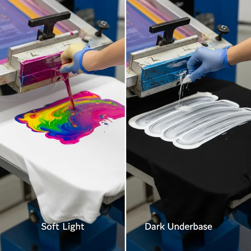
Direct color printing works on light fabrics without underbasing. Kornit Digital’s comparison explains: “Printing on light-colored garments is a straightforward process due to the absence of a need for a white underbase…Since the fabric itself provides a neutral base, colors appear bright and crisp without any additional processing steps”. Most ink colors print directly onto light fabric with good opacity and true color reproduction. This simplifies design preparation—colors specified in artwork translate directly to printed colors without intermediate white layers.
Color vibrancy and detail maximize on light substrates. Fine details and thin lines print cleanly without risk of disappearing into dark background colors. Halftone dots remain visible at smaller sizes, enabling photographic effects with finer screens. Light colors (yellows, light blues, pinks) that would be invisible on dark fabric appear vibrant on white shirts.
Design considerations for light shirts include broader color palette options (including pastels and light tints), thinner ink deposits for soft hand feel, fine detail capabilities with smaller mesh counts, and single-pass printing for many designs (no underbase required). These advantages explain why white t-shirts remain the most popular screen printing substrate.
Printing on Dark-Colored T-Shirts
Dark fabrics (black, navy, dark heather, forest green) require different techniques to prevent colors from appearing muted or invisible.
White underbase requirement represents the fundamental difference when printing on dark shirts. The Fibre2Fashion article explains: “While printing on dark colors of garments a separate screen of white under-base is highly recommended. The under-base keeps the top viewed colors from blending with the dark background garment dye which produces a muted image color known as bleeding”. Without underbase, colored inks mix optically with dark fabric, creating muddy or completely invisible results. The article notes critically: “And if white ink is not one of your design colors, and then you need to ADD this white screen to the total colors in your design – can increase you costs”. A three-color design on dark fabric effectively becomes four colors (white underbase plus three top colors).
Printing sequence and technique become more complex. Dark shirt printing typically follows this sequence: print white underbase and flash cure it partially, print first top color and flash cure, print subsequent colors with flash curing between, and final full cure after all colors applied. This multi-step process increases production time and complexity compared to single-pass light shirt printing. Kornit’s guide notes that with dark garments, “printing…requires pretreatment and a white ink underbase to maintain color accuracy and vibrancy”.
Design limitations and considerations on dark fabrics include bolder graphics without fine detail (heavy white underbase can’t reproduce tiny elements), increased ink deposits creating thicker hand feel, higher costs due to additional underbase screen, and color limitations (light colors difficult even with underbase). The Fibre2Fashion article emphasizes: “And also the graphics for printing on dark colors are bolder – without fine details since a heavy layer of light colored ink must be applied in order to cover the dark substrate and prevent bleeding”.
Discharge printing alternative removes fabric dye instead of covering it with white. This specialized technique dyes removes the original dye and replaces it with the design color, creating ultra-soft prints without heavy ink deposits. However, discharge only works on 100% cotton with reactive dyes and requires specific design preparation. Our pillar article on mastering screen printing designs discusses discharge as one of several advanced techniques.
Creating Effective Screen Print T-Shirt Designs
Designing specifically for t-shirt screen printing—rather than adapting general graphics—produces superior results.
Working Within Screen Printing Constraints
Understanding limitations enables designs that work with rather than against the medium.
Color count decisions balance aesthetic ambition with practical realities. One-color designs offer maximum affordability and fast production, two-color designs add visual interest while remaining economical, three-color designs enable more complex compositions, and four-plus colors approach costs requiring larger production runs to justify. As discussed in our pillar article, each additional color requires separate screen preparation and printing pass. Successful t-shirt design often embraces limited palettes as creative constraints rather than limitations.
Detail and resolution considerations distinguish screen-printable designs from over-complex digital artwork. Small text below 8 points becomes illegible or fills in completely, fine lines thinner than 1-2 points may break apart or not reproduce, tight spacing between elements can close up during printing, and excessive detail in small areas gets lost at typical viewing distances. Bold, clear forms with adequate weight and spacing ensure reliable reproduction.
Designing for Garment Construction
T-shirts are three-dimensional objects with seams, collars, and drape—not flat surfaces.
Avoiding problem areas prevents printing difficulties. Designs too close to side seams can’t be printed with standard equipment, graphics extending into armpit areas face registration challenges, elements overlapping collar or hem may print poorly or be partially obscured, and designs ignoring fabric stretch may distort when worn. Industry standard placements evolved to work with standard printing equipment and garment construction.
Considering wearability and drape ensures designs look good on bodies, not just hangers. How will the design appear when the shirt drapes naturally? Does text remain horizontal when fabric folds? Will design elements be obscured by arms or accessories? These real-world wearing considerations distinguish effective t-shirt designers from general graphic artists.
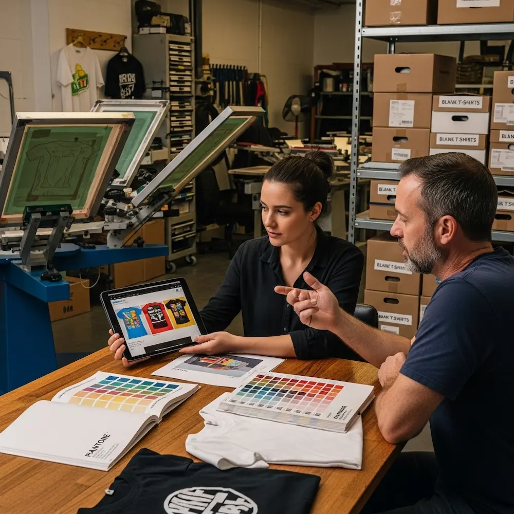
Working with Print Shops: Production Considerations
Most t-shirt designers work with commercial screen printers rather than printing in-house. Understanding production realities facilitates successful collaborations.
Communicating Design Specifications
Clear communication prevents misunderstandings and production errors.
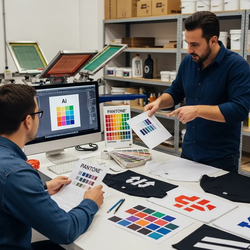
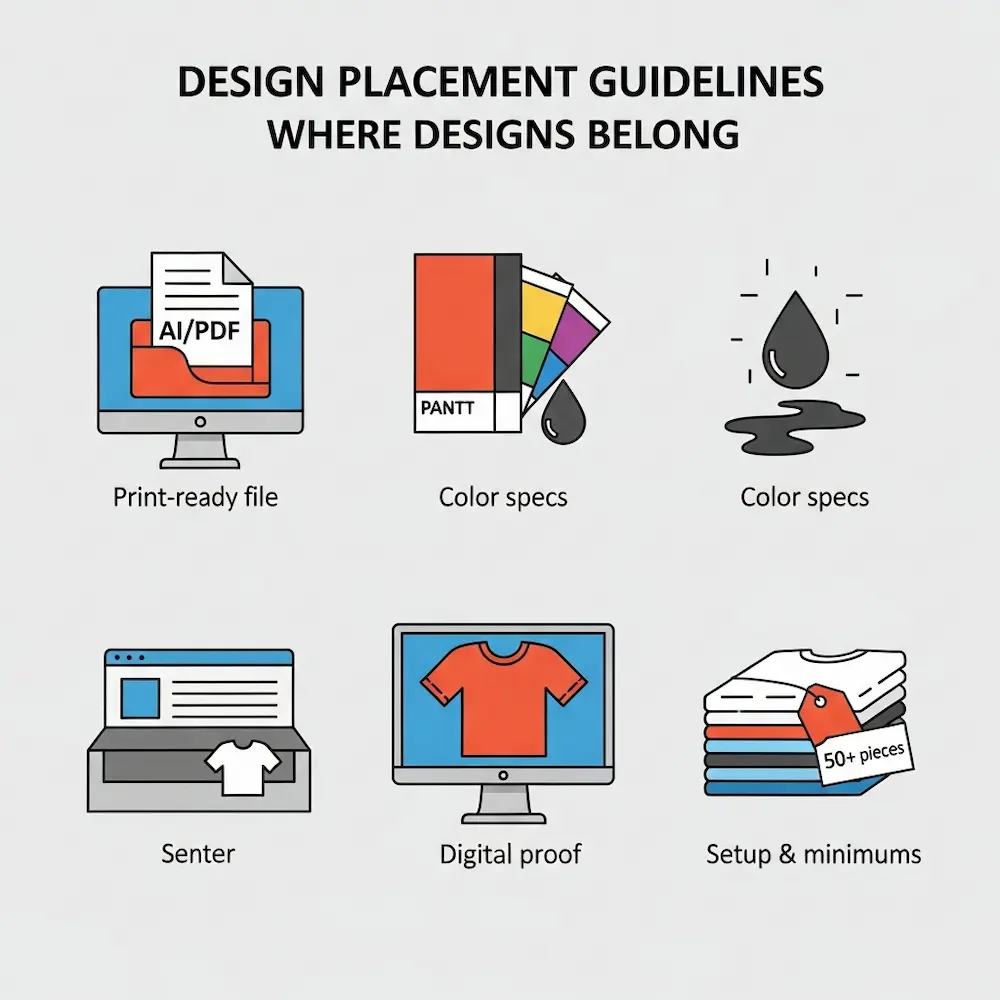
Providing complete design information includes artwork files in appropriate formats (vector preferred), Pantone color specifications for accurate matching, placement instructions with measurements, garment specifications (style, brand, colors), and quantity requirements across sizes. The Broken Arrow Wear site emphasizes their art department will “bring your T-shirt design ideas to life” when provided clear direction.
Mockups and placement visualization help ensure everyone shares the same vision. Digital mockups showing designs on actual garment photos reveal placement issues invisible in flat artwork files. Many print shops provide mockup services during approval stages. As my opening story illustrated, visual confirmation prevents expensive placement mistakes.
Understanding Pricing and Minimums
T-shirt screen printing economics favor certain order profiles.
Setup costs and minimum quantities make small orders disproportionately expensive. Screen preparation, ink mixing, and press setup occur regardless of quantity printed. Most screen printers set minimums (typically 24-50 pieces) where per-unit costs become reasonable. The Screen Printing guide notes printers must “keep the screen registered” throughout runs, requiring setup investment paid back through quantity.
Per-color pricing structures mean simpler designs cost less. A four-color design on dark shirts (requiring white underbase) effectively costs as much as a five-color design—something budget-conscious designers consider during concept stages. Understanding how printers price helps designers make informed decisions balancing aesthetic goals with financial realities.
Conclusion
Screen printing t-shirt designs succeed when technical precision supports creative vision—proper placement ensuring professional appearance, appropriate sizing maintaining balance across garment ranges, and design approaches accounting for fabric color, screen printing limitations, and production realities. From the industry-standard measurements positioning center chest prints 3-3.5 inches below collars to the critical difference between printing on light versus dark fabrics requiring white underbases, these technical specifications transform good artwork into great wearable products. Understanding that left chest prints should stay under 4 inches, full front designs range 10-14 inches wide, and youth sizes need approximately 25% smaller designs than adult equivalents prevents the placement disasters that waste materials and time.
The creative inspiration explored here—from bold vintage graphics and typography-focused designs to specialized categories including sports apparel and band merchandise—demonstrates how successful screen print t-shirt designs embrace the medium’s characteristics rather than fighting against them. Limited color palettes become aesthetic choices, bold forms replace fine detail, and designs conceived specifically for physical garment production succeed where complex digital art adapted as afterthoughts fails. Whether launching custom apparel brands, creating merchandise for organizations, or producing artistic wearables, mastering these t-shirt-specific considerations distinguishes professional results from amateur attempts.
For broader context on screen printing design principles, our pillar article on mastering screen printing designs covers fundamental techniques including color separation and software selection, while our other cluster articles explore the best design software for screen printing with halftone tutorials, step-by-step processes for creating screen print designs from concept through production, and creative inspiration through cool screen print designs across applications. Together, these resources provide comprehensive understanding of screen printing from technical foundations through specialized t-shirt applications, ensuring designs achieve both aesthetic excellence and production success in this demanding yet rewarding medium.


